How to Optimize Images for Twitter
In order to create the best blog post, you should combine excellent content and equally amazing images. Pictures are extremely important. Eye-catching graphics and photos are one of the best ways to catch the attention of your followers on social media and to also attract new audience to your site from Instagram, Pinterest, Facebook, Twitter etc. When you post high quality, original images, there's more of a chance that they'll be repinned, retweeted, or/and shared. That means more traffic driven back to your blog.
When you post an image on Twitter, it shows a preview right in your feed without having to click on any links - which is quite cool. However, the in-stream preview is a section of your image that Twitter automatically chooses to display.
Twitter’s in-stream preview is 440 pixels wide and 220 pixels tall (a 2:1 ratio).
That means that if your image's dimensions are not of a 2:1 ratio, parts of the top and bottom of your image will be cut off.
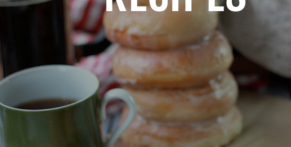
So, for example let's say that you've found the perfect image to accompany your blog post and added your catchy title on it as well like the one below.
Mmmmm.... not ideal if you ask me! You can still see part of the delicious donuts, but I've completely lost my text which is very important to show what the post is all about.
So, how can you optimize your images to look good in the Twitter preview?

There are a number of ways to make sure that the in-stream preview doesn’t leave out the best parts of your picture.
- Make sure your image dimensions are a 2:1 ratio.
Even though that solves all your problems and all of your image will appear in the in-stream preview every time, however it can be quite restricting in the case you ever decide to use a portrait or a square image.
So, in that case you should:
- Pre-figure what will show in the in-stream preview.
You can easily do that by following these steps:
Find the center of your image.
Find the 2:1 ratio of your image, in other words the dimensions of the in-stream preview.
To do that you'll have to divide your width by 2.
So for example, the dimensions of the image above are 600x878. If I divide the width (600) by 2 then the 2:1 ratio of the image shown in the preview will be 600x300.
That means 150px above and 150px below the horizontal line that crosses the center of your image.
What I like to do, is create a new layer with the dimensions of the in-stream preview that I've just calculated and place it on my image. I usually choose a nice vibrant colour, but I like to also make it around 55% opaque so that I can still see what part from my original image will be shown.
Then I move my text around so that it falls in the blue rectangle. At this point I might have to do some adjustments in size or change the font depending on the image.
Finally, I remove all the lines and the blue layer and I'm left with the perfect image for my post that is Twitter optimized!
Now, when I post this image on Twitter I get this:
Which is a million times better than what I had before!
So there you have it. Twitter optimized images every time.
How do you optimize your images before posting them on social media?


Images: 1 // 2


