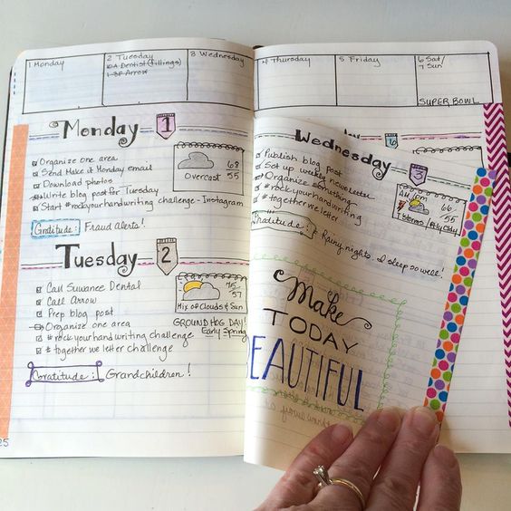
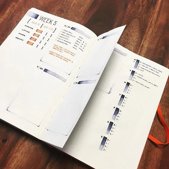
Dutch Door Ideas for your Bullet Journal
I found out about the 'Dutch door' system for your bullet journal when I watched @Alexandra_Plans's video on YouTube. After that I just knew I had to try it out!
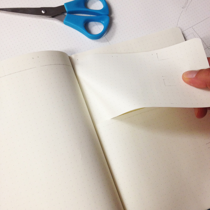
The 'Dutch door' system is a way of creating a weekly spread in your bullet journal, where part of the page remains stationary and the other part is normal and you can turn the pages as usual. This system can be applied horizontally or vertically. The difference is that with the horizontal you have to tear off part of the pages, while with the vertical way you just have to fold a page in half vertically and move it around as needed.
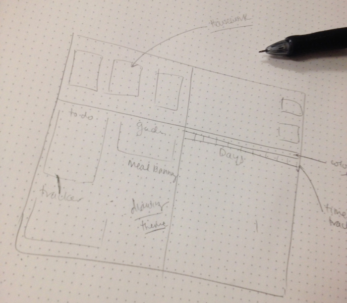
I decided to try the horizontal way, because I believe it's gonna work better for me (and I was feeling very daring on that day!!!). The first thing you need to do is to plan ahead how you'll use the space on the pages and measure everything in detail, because once you've cut those pages there's no turning back!!!
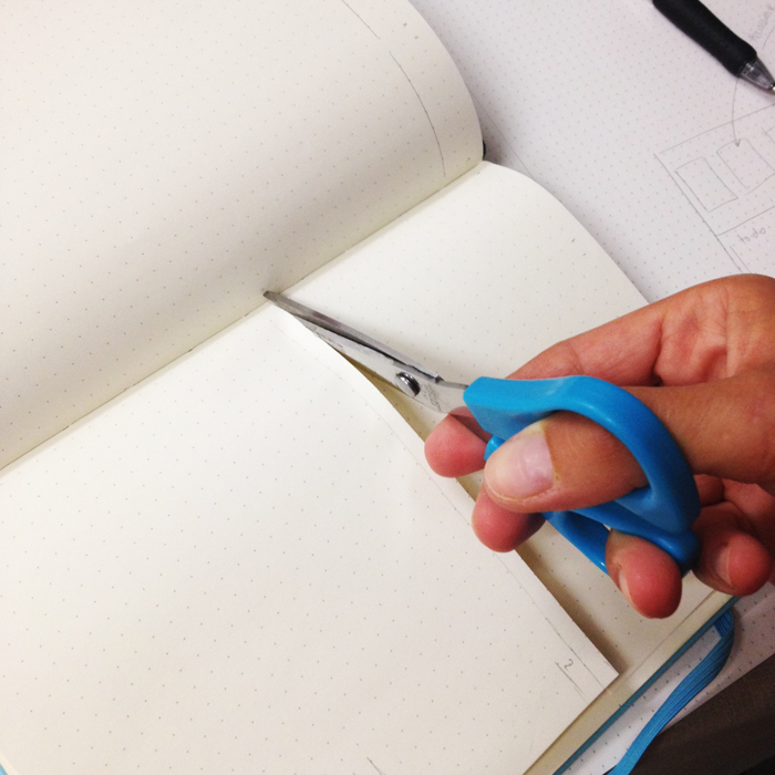
When you're ready, cut with a pair of scissors horizontally the pages where you've marked them.
Then hold the cut pages and pull really carefully towards you. This can be a bit tricky and nerve racking but just be patient and carefull and you'll do it ;)
After that just go ahead and fill in the pages as you've plant from the beginning. You may also add some washi tape at the top of the pages you've cut. I decided to leave it as it is and here is the end result:
Dutch door ideas for your bullet journal - www.christina77star.net
To get even more inspired, here are some examples of the dutch door system by some amazing bullet journalists:
Cristina's design from @My.Life.In.A.Bullet is absolutely stunning!!! You just have to check her Instagram account out! You have to!!!
I'm in love with the polka dots and Marissa's layout!!! She has more 'dutch door' weekly spreads in her Instagram account @choosingbliss.
I love how Victoire from 'Vik's Studyblr' has used the space in the pages. Check her blog out for more inspiration.
If you are a busy mum, then the vertical dutch door system for your bullet journal is what you need. See how Evie and Sarah from www.evieandsarah.com make use of it! Simply genius!!!
Kimberly's layout looks great and I love the colours she's used!!! At her website 'Sublime Reflection' you can find some amazing inspiration for your bullet journal.
I just love Karen's style from @beastmode.bujo. Make sure you check her out.
For some of the above pictures I couldn't find the owner to give credit, so I just added the link I found the picture at. If this is one of your pictures, or you know who created these spreads please let me know in the comments below so that I can give them credit. ;)

>> Here are my favourite Resources that I use every day with my Bullet Journal.
Click to find out what I love to use.
I absolutely love the way it looks and the functionality of it and I'll be definitely using this technique again for sure! Have you tried the dutch door system? If you have make sure you share with us in the comments below ;)


