Bullet Journal: My May Set Up
I know I'm pretty late with my May Set Up, but the last few days have been crazy busy!! To tell you the truth, I was contemplating whether to actually write this post or not. As you'll see, my May set up is very VERY minimum! I didn't know if it was worth it. But I wanted to continue doing the monthly set up series as I normally do, and to be honest, even though there's not much to share with you, I still believe that they are very functional pages and you could still get something out of this ;)
So, my very first spread for May is the front page of the month. I usually do my little doodle with the penguin, but this time I wanted to experiment with something new and different. And this is the result:
I used some tracing paper for the front part, where I wrote 'May' for the month. And I used double sided sticky tape to attach it to the page. For the background, I used various colours of acrylic paint as I mentioned before, and I used a technique to layer the colour very thinly so that it doesn't damage the page. If you'd like me to create a tutorial for this technique, let me know in the comments below.
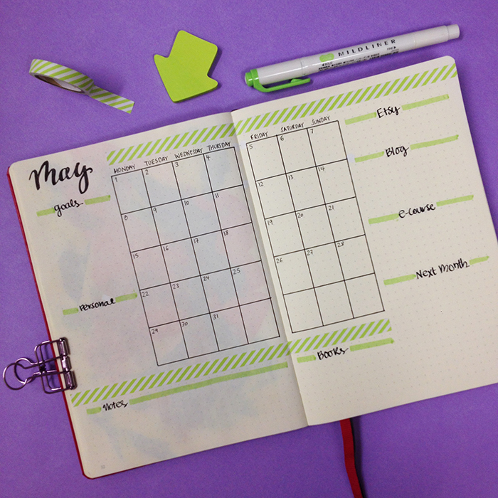
The next spread is my monthly spread for May. I decided to change things around a bit and this is the end result.
I added a smaller version of the month at a glance layout in the middle and lots of different categories around it. This way I have everything I need in one page and that really makes me focus and plan my month ahead. For this layout, I was inspired by @amanda_plans_ on Instagram.
I decided to not include any of my usual spreads this month. I've been so busy the last weeks that I never got around to even look at these spreads and fill them in during April. So this time, I decided to leave them out completely - just for May.
The only other spread I've created after that, is my weekly spread for the first week of May.
Believe it or not, it's the first time I'm using washi tape in my bullet journal! (shocking!!! I know!!!). I usually like to draw and doodle around, but this time I wanted to try something else. I got inspired for this layout by @bulletbyjulia on Instagram and for the little pictures idea by @studywithinspo.
I tend to prefer a vertical to a horizontal layout for my weeklies, and this turned out perfect for me. I might make some changes next week and add a bit more colour, but generally this is a very functional layout. :)
So, there you have it. My very minimal but still very functional and fun May Set Up in my bullet journal. What changes have you made this month?


