Plan With Me: My Bullet Journal Monthly Setup for October 2019
Hello everyone! 😘
I know it’s been a while but I’m finally back with another plan with me blog post!
September is almost over and I’ve finally finished setting up my bullet journal for October. I have a confession to make. I didn’t use my bullet journal in August and most of September and I have to say that my productivity was highly affected!! I really missed planning in it and being organised with all my to-dos, so I'm more than ready to start using it again!
The theme that I went with for October is ‘Mushrooms’. 🍄 I find mushrooms cute, and very tasty (!) and I’m really happy with the way my pages turned out.
Make sure you scroll down to the bottom of the post, because there's also a video, where I'm showing you exactly how I've created each spread.
For the front page of the month, I decided to create a mushroom house and lots of little mushrooms around it. I got inspired by the amazingly talented @manka_kasha. I can literally get lost in her drawings. I highly suggest that you check her work out. It’s amazing! I love how the front page turned out and I’m glad that didn’t use the traditional more warm colours that you usually associate with autumn. Instead I’ve opted for more cool blues and greys.
Next comes my Monthly Layout. I used my usual grid for the monthly layout and I’ve also added a to-do list on the left for each week. I like when I am able to allocate specific tasks for each week of the month. I find that I am more productive and that I’m actually getting things done, this way.
Each square is 7x7. I’ve also added lots of mushrooms and a shy hedgehog at the bottom! 🍄
Lastly, I’ve created the first weekly of the month. I decided to use a new layout that I got inspiration from the lovely Boho Berry. But I’ve made some changes and I’ve adjusted it to suit my day to day needs. As you can see, I made a mistake with the days. In order to fix it, I just stroked though it and added the right day on top. 😃 How do you deal with mistakes in your bullet journal? If you’re interested, I have this and that blog post talking all about them! 😃
Also, I love how the little snail turned out in this page! 🐌
SUPPLIES USED:
Tombow Dual Brush Markers (N65, 946, 192, 993, 603, 373, 158, 025, 815, 443, 528, 533, 493)
And that is my bullet journal monthly setup for October. I hope you liked it and that you’ve found some inspiration and ideas to setup your own. Let me know in the comments below what theme you’ve chosen for this month.
Plan With Me: My Bullet Journal Monthly Setup for August 2019
Hello everyone and welcome back to another plan with me blog post!
July is almost over and I’m currently packing my suitcases (let me tell you I don’t travel light!!!😬) for Greece! I can’t wait to go back and see my family and friends. But also I can’t wait for some well deserved time off! This year so far has been amazing and I’m so, so grateful for everything. But it has also been a hard work and I’m ready for a break. But I have lots of new things planned for the rest of the year, and I can’t wait to share it with you.
For now, let’s focus on the August setup in my bullet journal. I am not going to lie, I just wanted to create something fun and easy, because I just didn’t have time to plan something more intricate. So, for the setup of August, I decided to use some of my stickers to decorate my pages. And the theme for this month is ‘Ice Cream’ 🍦
(There won’t be a video for this month.)
Hello everyone and welcome back to another plan with me blog post!
July is almost over and I’m currently packing my suitcases (let me tell you I don’t travel light!!!😬) for Greece! I can’t wait to go back and see my family and friends. But also I can’t wait for some well deserved time off! This year so far has been amazing and I’m so, so grateful for everything. But it has also been a hard work and I’m ready for a break. But I have lots of new things planned for the rest of the year, and I can’t wait to share it with you.
For now, let’s focus on the August setup in my bullet journal. I am not going to lie, I just wanted to create something fun and easy, because I just didn’t have time to plan something more intricate. So, for my August setup, I decided to use some of my stickers to decorate my pages. And the theme for this month is ‘Ice Cream’ 🍦
(There won’t be a video for this month.)
I used three of the ice creams that are available in the sticker set and I wrote ‘August’ with big thick letters underneath. It took me only 5 minutes to create the front page and I really love how it turned out. Really cute, simple and yummy! 😋
I had so much fun creating those stickers for my shop, and I’m glad that I was able to use them for my Monthly Setup too. For the whole month I used the Ice Cream Die Cut stickers.
I’ve also used the same ice creams to create a printable card that will be available to my Patrons in August. If you'd like to become a Patron too and get access to all the printables, then you can visit my Patreon page.
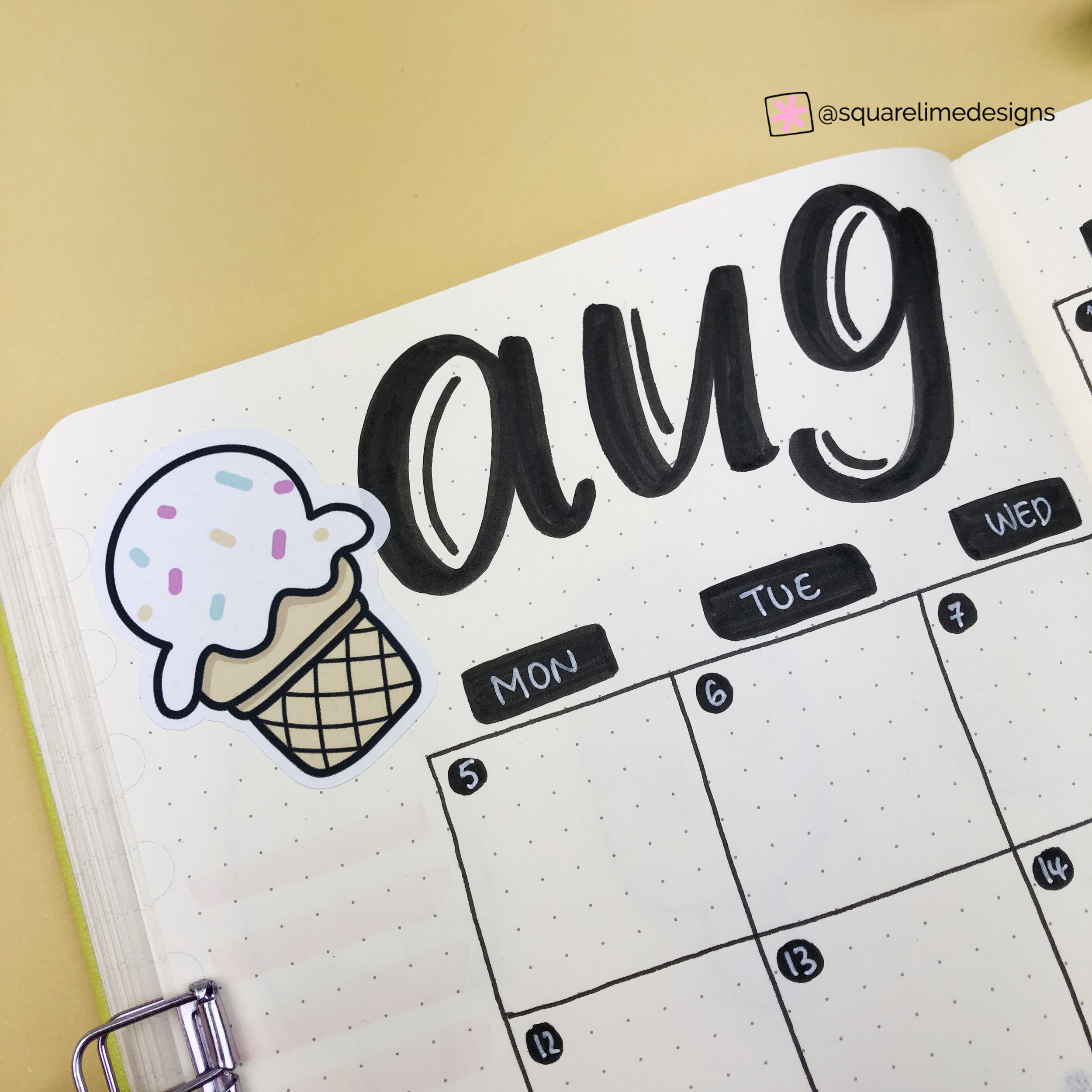
Next comes my Monthly Spread. I used my usual grid for the monthly layout and tried added lots of black details.Each square is 7x7. I also added two more ice creams from the sticker set to decorate it. Simple, and ready to be filled with lots of holiday planning ☺️
I also decided to create all the weekly spreads, for the time that I’ll be away, from now. Because, let’s be honest, I won’t have time to plan and decorate weekly spreads while on vacation. I want everything to be ready for me to fill it in with memories and lots of journaling (not a to-do list in sight!!!). I was inspired by the lovely soosanmoo and I decided to create a dutch door daily system for all my weekly spreads. So, all I had to do is cut 2 pages (as you can see in the picture) and add the days.
I added the days in a row without following a week per spread. That way I could add more days in the 5-page spread and cover all the time that I’ll be away for my holidays. I love this system, and I’ll definitely use it again.
Each weekly spread is different with different shapes and layout, but I made sure to use black and white accents in all of them. And of course I had to use more ice cream stickers from my set to decorate it and tie it with the theme of the month. I’m really glad with the way it turned out and I’m ready now to plan and journal throughout my holidays. 😎
And that is my bullet journal monthly setup for August. I hope you liked it and that you’ve found some inspiration and ideas to setup your own. Let me know in the comments below what theme you’ve chosen for August.
Plan With Me: My Bullet Journal Monthly Setup for July 2019
Hello everyone and welcome back to another plan with me blog post!
I’m not going to lie. I’m really glad that June is almost over and I can’t wait for July to come! June is always more busy, but this year I found it really hard to keep up with all my tasks and to dos during the day. So, I’m ready for some vacations and some time off 😎
In the beginning I was planning to create a different theme from the one I’ve chosen for July. But one of my Patrons (Tracy!) contacted me with a theme idea that was too good to ignore. So, for July the theme is ‘Camping’.
Hello everyone and welcome back to another plan with me blog post!
I’m not going to lie. I’m really glad that June is almost over and I can’t wait for July to come! June is always a more busy month, but this year I found it really hard to keep up with all my tasks and to dos during the day. So, I’m ready for some vacations and some time off 😎
Also, did I mention that July is beginning on a Monday!!!???? 🤩 For some reason that always makes me happy!!! (Planner’s issues!!!)
In the beginning I was planning to create a different theme from the one I’ve chosen for July. But one of my Patrons (thank you Tracy!) contacted me with a theme idea that was too good to ignore. So, for July the theme is ‘Camping’.
(There won’t be a video for this month.)
I started drawing as usual in my bullet journal and I created the front page (as you can see above). However, I wasn’t happy with the way the colours were blending and I really wanted to create some camping themed stickers as well. So, in the end I decided to leave the monthly planning aside for some time and I focused on creating some cute camping illustrations on my iPad.
I thought that they turned out so cute, that I wanted to use them in my bullet journal planning for July, instead of me drawing on the pages. It was actually nice to be able to finish the monthly planning in no more than 30 minutes, and I was really pleased with the result. So, as you can see above, I used the stickers to create my front page for July. By the way, I’ve always wanted to have a cute little caravan like this! And the little bear is really adorable!!!
You can now find the Camping Stickers in my Etsy Shop and add some cuteness in your bullet journal too. 😘
Next comes my Monthly Spread. I used my usual grid for the monthly layout and tried to use the space as much as possible for all the holiday planning. I’m using an A5 Dingbats Notebook (which is a bit wider than the other notebooks), so I managed to fit in all the squares in the pages. Each square is 7x7. I also added a to-do list on the left and some notes space on the right hand page. I chose to decorate it with a camp fire and a marshmallow! I also have a confession: I’ve never had s’mores before, so it’s definitely one of my to-dos for this summer!
I’ve also turned this spread into a printable that will be available to my Patrons in July. If you'd like to become a Patron too and get access to all the printables, then you can visit my Patreon page.
I also created the first weekly spread of the month. Isn’t it great that the month starts on a Monday!? It feels like everything is in order! I chose a vertical layout that I was using a lot before. I also separated each day in two different sections. You can use the top part to plan appointments, add your top 3 to-dos, add your daily gratitude, use it as a doodling space or plan your meals. It’s such a good weekly layout, with very good use of space of the page. Love it!
Can I also mention here how cute this naughty racoon looks!!! And also those flies for some reason make me smile!!!
And that is my bullet journal monthly setup for July. I hope you liked it and that you’ve found some inspiration and ideas to setup your own. Let me know in the comments below what theme you’ve chosen for July.
Plan With Me: My Bullet Journal Monthly Setup for June 2019
Hello everyone!
It’s already time for me to share with you my bullet journal monthly setup for June. All the layouts and spreads that I've chosen to use this month.
Finding a theme for each month’s setup in my bullet journal is not always easy. I like to find fun themes that I enjoy to create, but also themes that will give you some inspiration in order to plan your own monthly setup in your bullet journal. A lot of people ask me how I come up with my themes. The answer is very simple, really. I have a sketch book where I doodle all the time. I get my inspirition online (mainly from Pinterest), and I just doodle anything I want. Halfway through the month, when I start thinking about the theme for the month ahead, I just open my notebook and choose a theme (or design) that I like to recreate and start from there.
This month I’ve chosen a theme that makes me smile. And that is ‘Cute Couples’.
Make sure you scroll down to the bottom of the post, because there's also a video, where I'm showing you exactly how I've created each spread.
As always we start with the Cover Page of the month. I think that one of the most classic cute couples has to be ‘Cookies and Milk’. I love how this page turned out and these little guys put a smile on my face! ☺️ I used only my Tombow markers again for all my pages. You can check all the supplies that I’ve used, at the end of this blog post.
There are so many cute couples that you can add to this theme. And for the pages of my bullet journal I had to choose only a few to add. If you’d like to see more cute couples, you can check out the stickers that I've created for this theme in my Etsy Shop. Aren’t they adorable?
You can now find the Cute Couples stickers in my Etsy Shop and add some cuteness in your bullet journal too. 😘
Next comes my Monthly Spread. I decided to keep this layout very simple and I was inspired by the amazing Helen. I love the way she uses the space on the page and I decided to do the same. I also love that she keeps the space between each box smaller than usual.
I’ve also turned this spread into a printable that will be available to my Patrons in June. If you'd like to become a Patron too and get access to all the printables, then you can visit my Patreon page.
We have a lot of things happening during June, so I need the space to plan things properly! School Exams for my boy, Primary School prom for my little girl, English finals for both of them. Plus lots of birthday parties! A very busy month for sure.
Having those cute pancakes and syrup on the page will definitely make planning more fun! Another classic cute couple that I had to include in my bullet journal monthly layout for June.
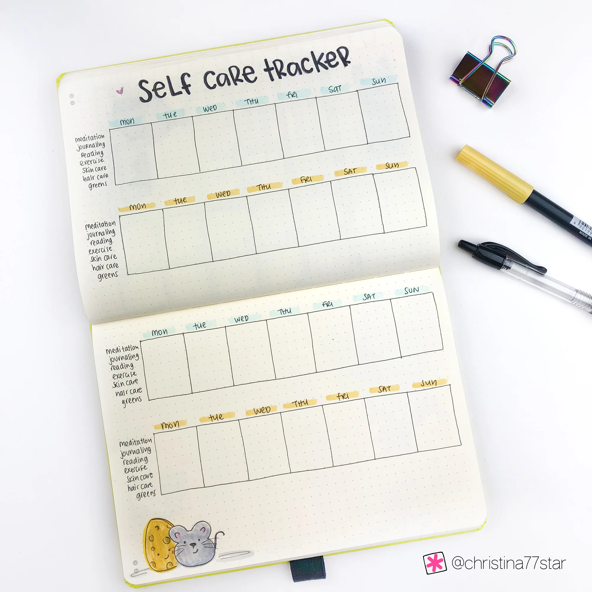
On the next page I added something new. I’ve actually been using this layout for a while on a printable that I found from Annie Jeffrey. But this month, I decided to incorporate it in my bullet journal, so that I keep everything in one place. This is a Self Care Tracker. It’s similar with any other tracker, however instead of little boxes where you tick off everything you’ve done in the day, there are bigger boxes where you can add more information if you wish. For example, I can write what exercise I did during that day, or how many calories I burned. I can note down when I dyed my hair and if I used a skin care mask etc. I prefer this type of tracker because I have more information about everything I want to keep track of.
Of course I had to add a cute couple at the bottom of the page to tie with the theme. Aren’t they adorable?
And then move on to the first Weekly Spread of the month. This a new vertical layout that I am using. I got inspired by the lovely @lildots.bigplans. I love the concept to add the times on the side of the box. You can use this to actually plan appointments, or you can use it as a time tracker, where you track how you spend your time during the day by colour coding in categories. The space underneath can be used for your to-do list, for journaling, menu planning and so on. Such a good weekly layout, with very good use of space of the page. Love it!
In the video below, I’m also sharing how I fill in my weekly and monthly spread, so make sure to check it out 😉
SUPPLIES USED:
Tombow Dual Brush Markers (243, 451, 991, 673, 025, N75, N79, N95, N15, 977, 942, 815 and 947)
And that is my bullet journal monthly setup for June. I hope you liked it and that you’ve found some inspiration and ideas to setup your own. Let me know in the comments below what theme you’ve chosen for June.
Plan With Me: My May 2019 Setup in my Bullet Journal
Hello everyone!
I’m back with another monthly setup in my bullet journal. April is almost over and I’m super excited for May to come (because it’s my birthday month! ✨). For me the rest of April is extremely busy and I wanted to have everything setup in my bujo as soon as possible. Some of you might be celebrating Easter this week. Here in Cyprus we celebrate Easter the week after, so there’s lots of things to do and arrange until then. Also the day after Easter we’re flying with my family to Vienna for week! I’m super excited about this trip and I can’t wait to visit this amazing city!!! From the pictures it looks gorgeous 😍 ✈️ If you have any recommendations for Vienna - like coffee shops, things to do and of course stationery shops - please let me know in the comments below!!! ☺️
The theme I’ve chosen for May is ‘cacti’ 🌵.
Hello everyone!
I’m back with another monthly setup in my bullet journal. April is almost over and I’m super excited for May to come (because it’s my birthday month! ✨). For me the rest of April is extremely busy and I wanted to have everything setup in my bujo as soon as possible. Some of you might be celebrating Easter this week. Here in Cyprus we celebrate Easter the week after, so there’s lots of things to do and arrange until then. Also the day after Easter we’re flying with my family to Vienna for a week! I’m super excited about this trip and I can’t wait to visit this amazing city!!! From the pictures it looks gorgeous 😍 ✈️ If you have any recommendations for Vienna - like coffee shops, things to do and of course stationery shops - please let me know in the comments below!!! ☺️
The theme I’ve chosen for May is ‘cacti’ 🌵. It’s a theme that I wanted to do for some time now. However, it’s not a unique theme and there are some amazing setups online from some very talented bullet journalists. So, I wanted to create my own version of it and make it different somehow. I’ve decided to keep it as simple as possible and to strip it down to the very basic shapes of a cactus. At the same time, I wanted to show people that you can be as creative as you want in your bullet journal and choose shapes and lines that are not the usual ones that you would associate with a cactus.
Unfortunately there won't be a video for my Plan With Me this month.
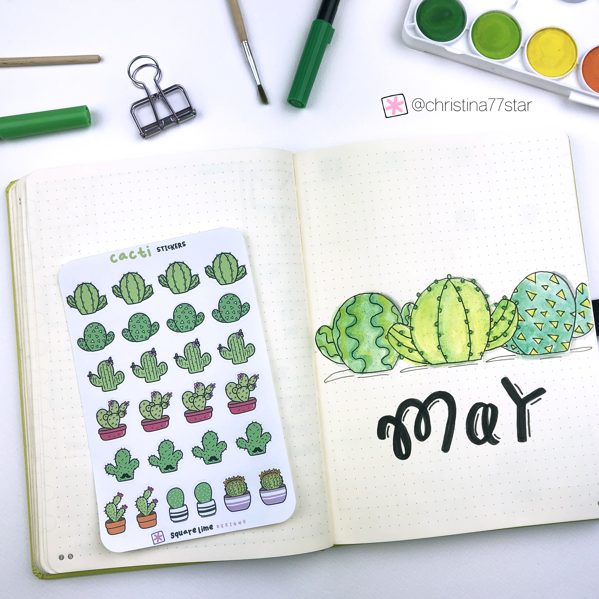
As always we start with the Cover Page of the month. I created 3 cute cacti using the basic shape. However, I wanted them to be different and unique. So, instead of the prickly lines I used zigzag ones, little circles and triangles. You can still see that these are cacti, but by changing the normal lines you’ve given them personality and made them to stand out. 🌵I also didn’t want them to be very clean and precise. I wanted them to look hand drawn and rough around the edges. So, I used again my watercolours with my Pentel water brush, and I love the effect that the different shades of green give.
You can check all the supplies I’ve used, at the end of this blog post.
I’ve also turned all the doodles of this setup into stickers. Aren’t they adorable?
There are mini cacti stickers with 8 different cacti designs, that fit almost all planners.
There are also bigger - die cut stickers that are really cute and can be used to decorate your bullet journals and recreate this theme.
You can now find the Cacti stickers in my Etsy Shop and add some cuteness to your bullet journal too. 😘
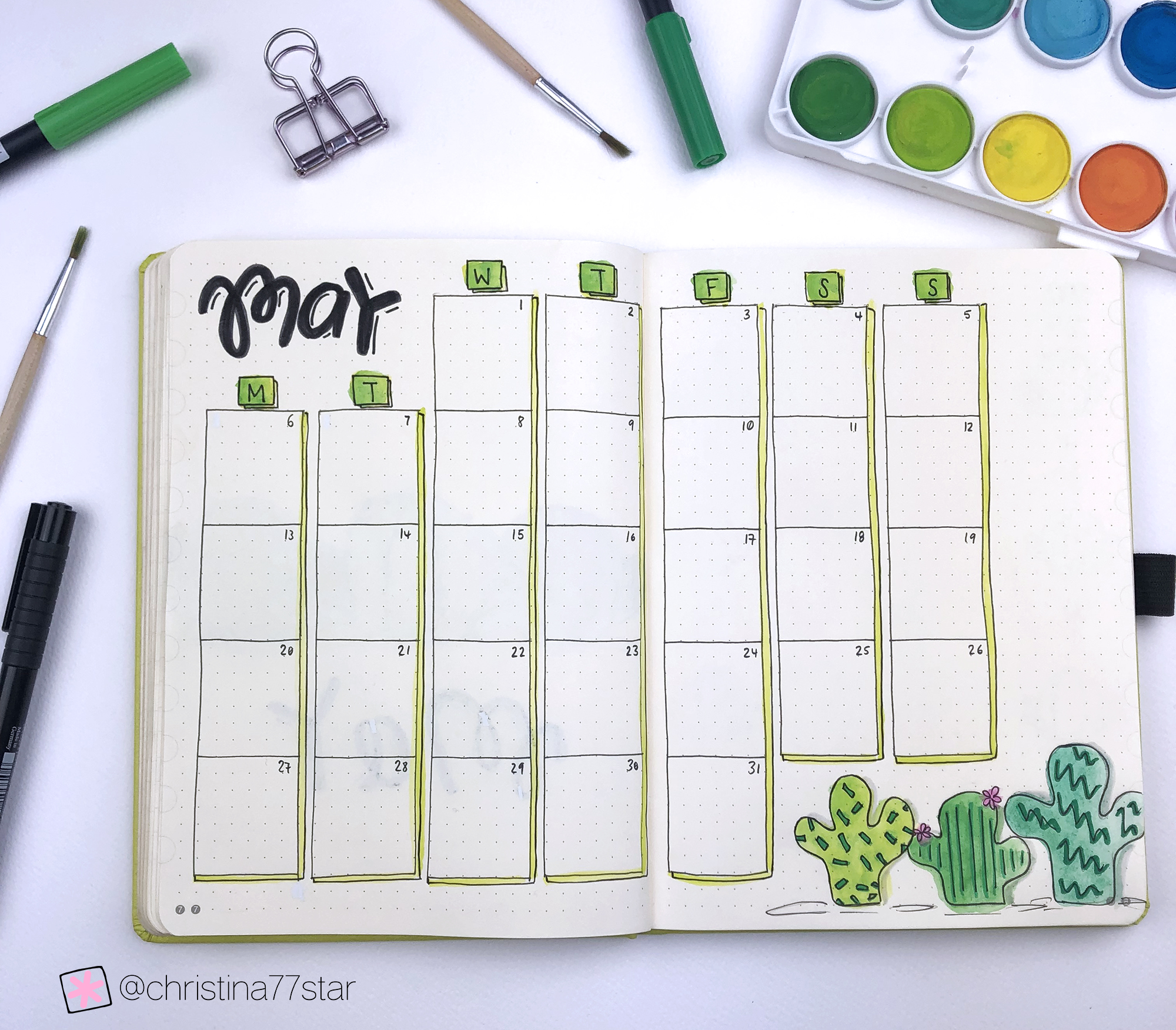
Next comes my Monthly Spread. I chose to use again a 2-page layout with the monthly calendar, but I played a bit with the boxes and added some green shading to make it a bit more interesting. I like to have big boxes that give me plenty of space to plan my appointments and activities. At the bottom of the page I added 3 more cacti to keep up with the theme. Again I continue with the same concept and instead of the normal prickly lines I use rectangles, straight lines and zigzag lines to add texture and uniqueness. The different shades of green add to this effect and I love how it turned out!
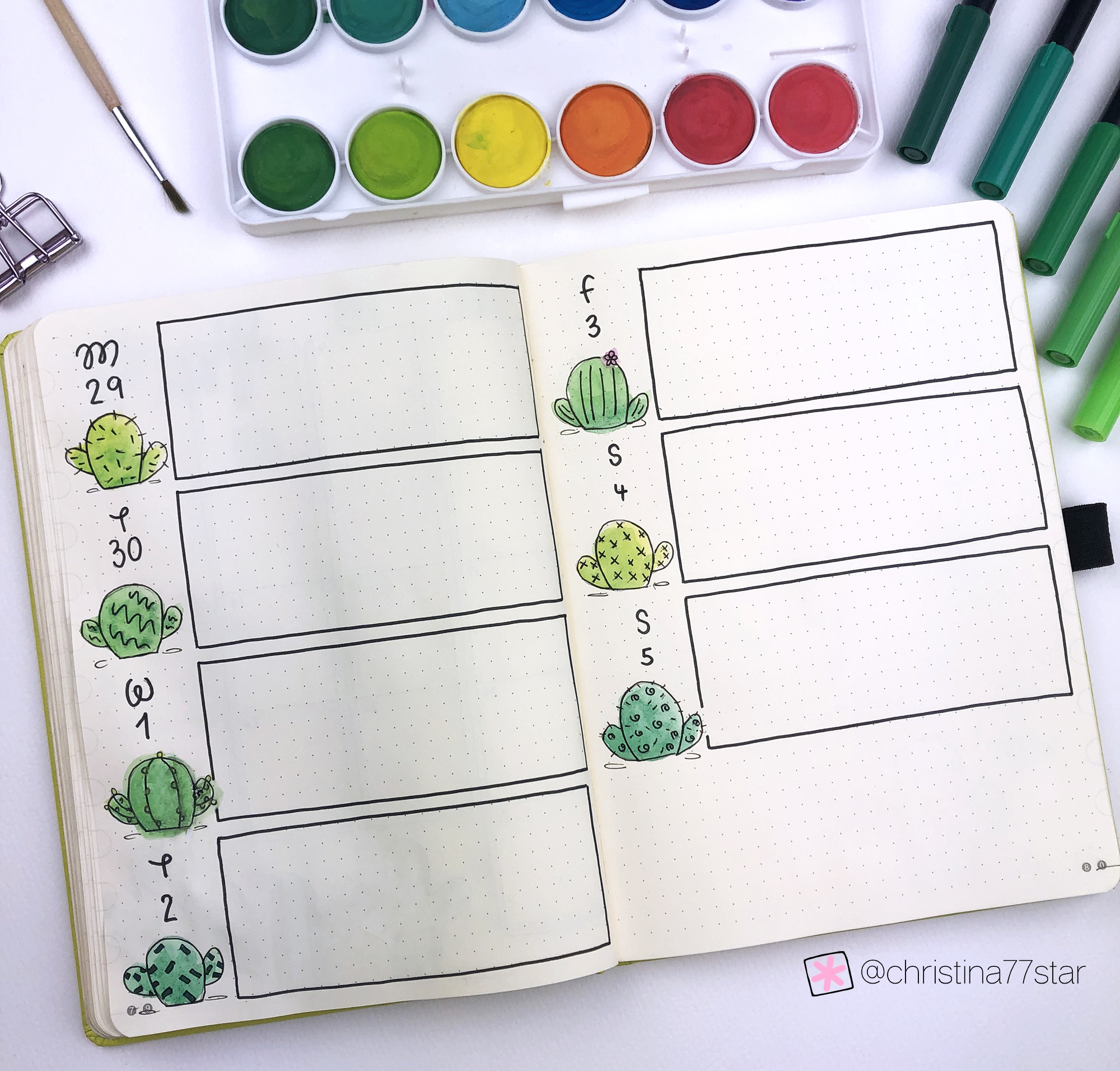
And then we move on to the first Weekly Spread of the month. I’ve went with a horizontal layout and added a different cactus for each day. Each one of them is different and I’ve also tried to give each one a different shade of green. It might look a bit messy but I love how this turned out. 🌵 You can use the mini cacti sticker set to add a cactus in front of each day of the week, if you’d like to recreate this weekly layout.
And that is the May setup in my bullet journal. I hope you liked it and that you’ve found some inspiration. Let me know in the comments below what theme you’ve chosen for May.
Plan With Me: My April 2019 Setup in my Bullet Journal
Hello everyone!
Isn't it amazing? Spring is finally here!!! Woohoo! 🌸 All these colours and smells always make me so happy ☺️ March has been such a nice month for me - both personally and professionally - and I’m so grateful for that! I drew a lot, created loads of new stickers (the Easter ones are my favourite!!!) for my shop and had some amazing time with family and friends ✨
I also created an account on Patreon!!! Yay! After a lot of thought and deliberation, I now have a Patreon page and I’m super excited about that. 😊 If you like my work and you're interested in supporting me on Patreon, you can choose how much you want to pledge per month (for as little as 1$). In return you'll get some fun rewards! (check them out here). You can join anytime, edit your pledge anytime and cancel anytime, and you get access to all online content as soon as you pledge.
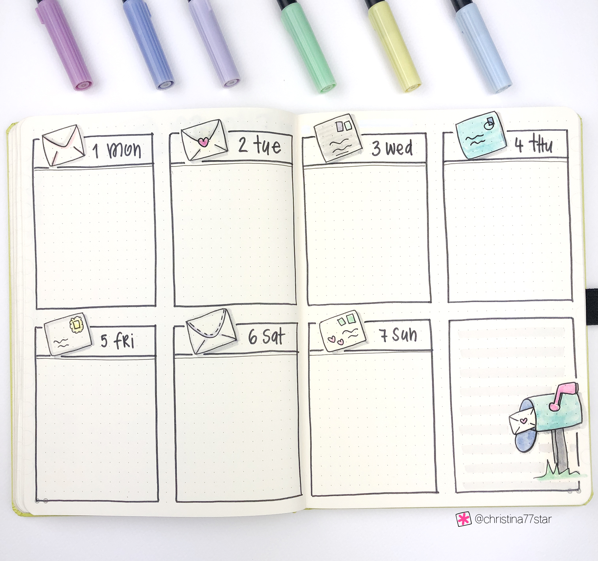
Getting back now to my monthly setup. April is letter writing month, so the theme I chose for my monthly setup in my bullet journal is ‘Happy Mail’! I think it’s so appropriate and I love how cute and nice it has turned out!!! 💌
Make sure you scroll down to the bottom of the post, because there's also a video, where I'm showing you exactly how I've created each spread.
As always we start with the Cover Page of the month. For April I created a cute little snail that is carrying some happy mail on top of his shell. 🐌 I don’t know why, but this page makes me so happy every time I look at it. I decided to use only my Tombow markers this time for all my pages. I like the effect of watercolour that I used to create last month’s setup. However, I wanted something quick and easy for this month’s pages.
You can check all the supplies I’ve used, at the end of this blog post.
I’ve also turned all the doodles of this setup into stickers. Aren’t they adorable?
You can now find the Happy Mail stickers in my Etsy Shop and add some cuteness to your bullet journal too. 😘
Next comes my Monthly Spread. I decided to keep this layout very simple and I was inspired by the amazing @saricastudio. I love the way she uses the space on the page and I decided to do the same. We have a lot of things happening during April, so I need the space to plan things properly! We’re also going to Vienna at the end of the month - which I’m very excited about!!! ✈️ If you have any recommendations for Vienna - like coffee shops, things to do and of course stationery shops - please let me know in the comments below!!! ☺️
On the next page I added my Monthly Focus - which is where I'll write my monthly goals for April. I decided to change the layout of the page this month. Now it is a 2-page spread where I have a full page dedicated for each section - personal and work. I find that if I create dedicated sections for each category, sometimes I need more space and it ruins the layout. So, this time I gave myself enough space to be as analytical as I want, and I love the way it turned out. Of course I had to add some cute little envelopes to tie the page with the theme. 💌
And then move on to the first Weekly Spread of the month, which is one of my favourites I’ve created!! 😍 I am using a layout that I use every single month, and I added a cute little envelope for each day. I used my black N15 Tombow marker to create the lines, because I wanted them to be thicker than my usual ones, and I also added some pastel colours to each envelope. For the notes section I created a post box and I think the whole page looks adorable! I can’t wait to start using it!
SUPPLIES USED:
Tombow Dual Brush Markers (761, 451, 620, 062, 553, 491, 673, 243, N15, N95 and N75)
And that is the April setup in my bullet journal. I hope you liked it and that you’ve found some inspiration. Let me know in the comments below what theme you’ve chosen for April.
Plan With Me: My March 2019 Setup in my Bullet Journal
Hello everyone!
February has been such a short month! It feels like it has only lasted 2 weeks! And here we are again planning for the next month. ☺️ Usually Cyprus has very mild winters. However, this year we have felt the cold and the rain, especially in the last two months. So, I needed some sunshine and colour in my bullet journal to welcome the spring (that’s hopefully around the corner! 🌸). I wanted to make my spreads nice and colourful, without going for the usual floral theme.
So, for March I chose to do a theme about colour.
Make sure you scroll down to the bottom of the post, because there's also a video, where I'm showing you exactly how I've created each spread.
As always we start with the Cover Page of the month. I personally like it when I add some sort of quote or saying in my cover page. So, every time I open my bullet journal I see it and get positive thoughts. For this month’s theme I went with the phrase: “Live a colourful life!”, which I placed on a canvas and added lots of paint splashes around, to add colour and dimension to the picture. I used my Tombow N75 to add the shadows that make the colour splashes pop. I really like how it turned out and it puts a smile on my face every time I look at it.
The trick with using watercolours in your bullet journal, is to add as less water as possible. And also you have to let it dry completely before you move on to the next page. I find it easier to use a water blush for this, but of course you can use a normal paint brush and some water.
This month I decided to create a Monthly Spread. I love that I have the option with this system to choose which pages I can add each month. This flexibility and personalisation is what drew me to bullet journaling in the first place. So, for March I went with a grid layout that I got inspired by the amazing @dutch_dots on Instagram. I really like this layout and the space it gives me on the left page to add all my monthly to-dos, appointments, notes etc.
I added some emoji colour buckets at the top, that I think are the cutest thing ever! So much so, that I made them into stickers! I created 8 adorable little characters that can fill with colour your pages. You can now find the colour bucket emotis on my Etsy Shop.
Cute!
Colour Bucket Emotis
On the next page I added my Notes Page. This has become a standard page in my monthly layout. This time around I decided to add some doodles to decorate it. So, on the top I added some paint brushes and on the bottom a paint tube. And as always I added my grey lines with my Tombow N75 marker.
For my Monthly Goals, I decided to do something different this month. I find that I’m very good at setting goals and plan things for each month. However, this time around I wanted to add actionable steps that will help me achieve those goals. I also changed a bit my 4 categories. Now my categories are: Health & Wellness, Career & Finance, Family & Relationships and Spiritual. I find that being more specific like this with my categories, helps me to set more specific and detailed goals. For each category I created 2 boxes next to each other. In the first box I’ll be writing my goals for this specific category, and in the second box I'll be writing the steps or actions that will help me to achieve it. This is a text month for this page. I’m not sure if the space I have will be enough to write all the things I want. So, we’ll see, and if needed I can turn it into a 2-page spread. But for now, I like how it looks and I can’t wait to start using it.
And then move on to the first Weekly Spread of the month. I chose one of my usual layouts, but I added paint buckets on each day to keep up with the theme and to add more colour. I also tried to create a rainbow effect, and I’m really pleased with the result. ☺️
SUPPLIES USED:
Tombow Dual Brush Markers (243, 491, 620, 062, 673, N95, N15, N65 and N75)
Watercolours by Tiger
And that is the March setup in my bullet journal. I hope you liked it and that you’ve found some inspiration. Let me know in the comments below what theme you’ve chosen for March.
Plan With Me: My February 2019 Setup in my Bullet Journal
Hello everyone!
February is just around the corner and that means of course that it’s time to plan our month in our bullet journal. I don’t know about you, but lately I tend to create less and less spreads in my bullet journal. I prefer to create only the ones that I like to use every month, and that help me with my productivity. For me simplicity is the key. So, I like to stay away from fancy layouts, trackers and all that.
For February I chose to use a theme that you might have seen in my Etsy shop. I love my little robots and I thought that February would be the perfect month to incorporate them into a theme for my bullet journal. So, let’s see the spreads that I’ve created in my bullet journal for February.
Make sure you scroll down to the bottom of the post, because there's also a video, where I'm showing you exactly how I've created each spread.
As always we start with the Cover Page of the month. I think the little robot is adorable and cute, and it puts a smile on my face every time I look at this page.
I chose to use more grey and pastel pink and blue colours. As always you can find the list of all the supplies I’ve used at the end of this post.
It might surprise some of you, but I chose to not create a monthly spread this month!!! * gasp * I find that my monthly layout is a page that I rarely use during the month, and since I’m creating all my weekly spreads from the beginning of the month, I don’t really need it. Therefore, the first page after my cover page is my Notes (which, by the way, is my most used page of my monthly setup!). I’m using again the same layout with the grey lines and I’ve added one more cute robot at the bottom of the page.
On the page opposite I added my Monthly Goals, which are separated in 4 categories: Me, Work, Relationships and Fun. I’m thinking of adding more categories to my goal planning, because I truly believe that the more specific and detailed you are when you plan things ahead, you get to achieve more goals and quicker.
And then we jump straight into my first Weekly Spread. As I mentioned above, I kept my setup really simple and minimal for this month, and I only added the most used pages. It’s nice to be creative and to add spreads and pages into your bullet journal. However, some months you just need to focus on more specific things, and any extras can be excluded from the setup that month.
Even the layout that I chose for my weekly spread is quite minimal with only that cute robot added to match the theme of the month.
SUPPLIES USED:
Tombow Dual Brush Markers (673, 452, 451, 800, 491, N89, N75, N95, N15, N45 and N79)
Sakura Gelly Roll White Pen 08
And that is the February setup in my bullet journal. I hope you liked it and that you’ve found some inspiration. Let me know in the comments below what theme you’ve chosen for February.


