Bullet Journal Ideas: 5 Weekly Spread Layouts for September 2018
I think I say the same thing in the beginning of each month, but seriously I can't believe it's September already! 2018 is literally flying by! I don't know about you, but I love this time of year. My kids are getting ready for school, and I think I'm more excited about it than them! I love buying stationery and school supplies, and getting their school bags ready. I also like it because as in January, it feels like a new start, a new beginning, within the year. It's another chance to re-focus and plan and schedule the last few months of 2018.
As always I like to plan my weeklies for the month in advance. That way I can plan everything properly and make sure that all my appointments and tasks are scheduled. For September the theme is 'Message in a bottle' and you can see how I've setup my bullet journal for the month in this post, or you can watch the video here.
September starts on a Saturday, and for this month I had to plan 5 different weekly layouts.
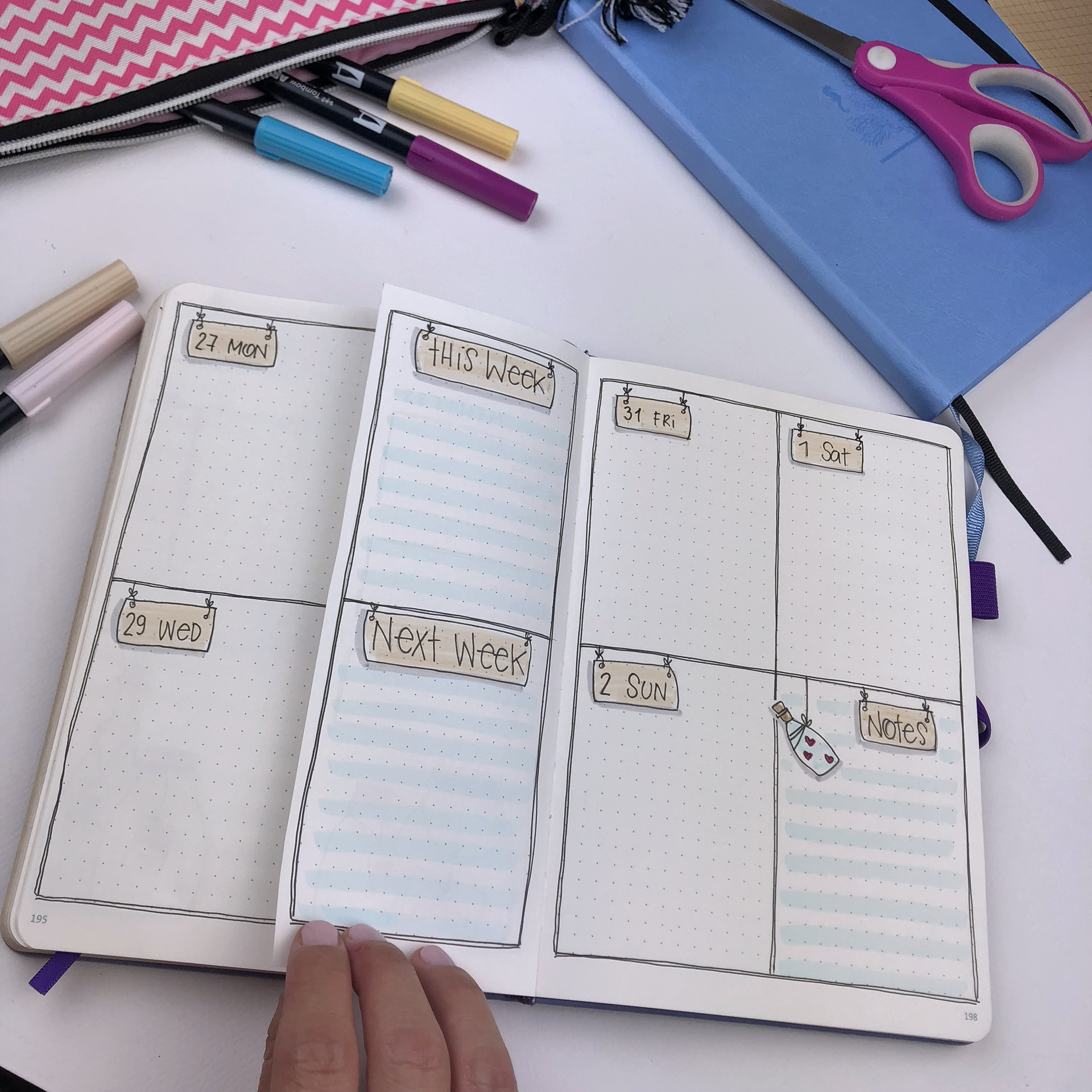
For the first weekly layout I chose to use a dutch door system.
I created the layout as normal, but I cut the middle page vertically in half, to use for my tracker and my planning for this and next week.
I find this type of layout really functional and I am going to be using it again in the future for sure.
This was the last page in my 4th bullet journal. The rest of the weekly spreads were created in my brand new one! I've chosen a Dingbats notebook for my 5th bullet journal, and I'm so excited to start using it. You can see my review and pictures of the notebook in this blog post.
For the second weekly, I decided to use a horizontal layout. If you've been following me for a while you know that I prefer the vertical layouts most of the time. I find that I can use the space better and I can create to-do lists for both personal and work related tasks. With a horizontal layout I find that I can't separate things. But I saw this layout by @organisedhustler and I decided to give it a go.
The line in the middle helps me to create 2 different to-do lists and separate my personal and work tasks! Love it!
The 3rd weekly spread is a layout I use every month. I decorated it according to the month's theme, and the only change I've made is that I extended a bit the space for my to-do lists.
Another layout that I use a lot for my weeklies is the one bellow. I love the sections that separate the vertical lists into categories. And the best part is that you can add as many sections as you want and choose the categories that work for you.
For the last weekly spread of the month I chose another horizontal layout! I like the boxes and the simplicity of it, plus I added a notes section. I might add some vertical lines, like I did in the 2nd layout, to create sections for my to-dos.
SUPPLIES USED:
Faber-Castell PITT Artist Pen in B, S, F
Tombow Dual Brush Markers (673, 491, 990, 533, 553, N89, N95, 451, and 800)
So, these are the 5 weekly layouts for September. I hope you liked this post and that you found some inspiration for your own weekly layouts. If you liked the theme and you'd like to recreate it, please send me some pictures. I'd love to see your pages!! You can always contact me at christina77star@gmail.com


