Bullet Journal Ideas: 4 Weekly Spread Layouts for October 2019
Hey there everyone! 🍄
As always, when I plan my month in my bullet journal, I like to also plan ahead all my weekly spreads. That way I'm prepared and I don’t have to rush every Sunday to plan my weekly. It’s also very functional to do it this way, because you can plan appointments and tasks easier and more efficiently. The theme for October is 'Mushrooms' and you can see how I've setup my bullet journal for the month in this post.
Hey there everyone! 🍄
As always, when I plan my month in my bullet journal, I like to also plan ahead all my weekly spreads. That way I'm prepared and I don’t have to rush every Sunday to plan my weekly layout. It’s also very functional to do it this way, because you can plan appointments and tasks easier and more efficiently throughout the month. The theme for October is 'Mushrooms' and you can see how I've setup my bullet journal for the month in this post.
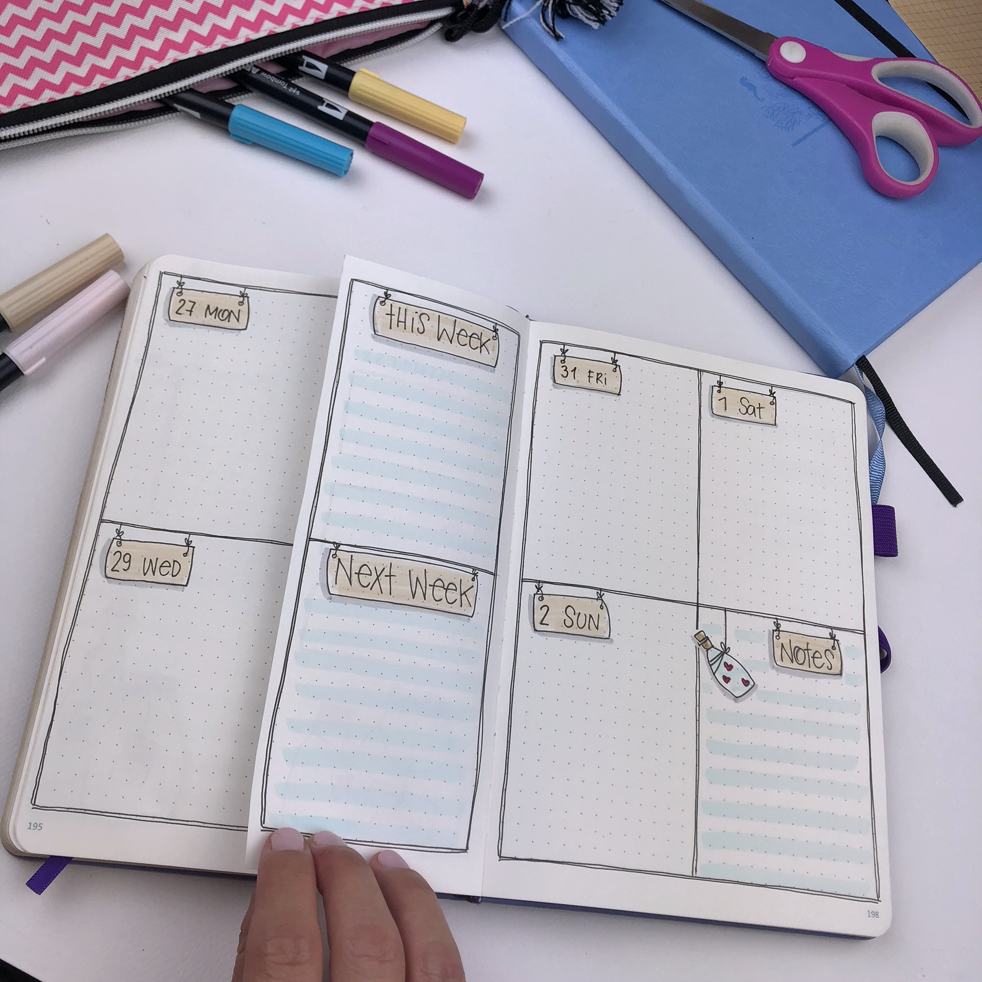
For my first weekly spread I decided to use a new layout that I got inspiration from the lovely Boho Berry. I made some changes and I’ve adjusted it to suit my day to day needs. It’s a vertical layout that uses half the page for the weekly day to day planning, and the other half of the page is used to generally plan tasks without allocating a specific date for them. Of course, you can utilise the page in any way you want and you can add any section that is more functional for you. For example, you can add some habit trackers, weather forecast etc.
As you can see, I made a mistake with the days. I remember in my first year that I’ve started using my bullet journal I would have been devastated with this mishap. However, nowadays it doesn’t bother me that much. I just stroked though it and added the right day on top. How do you deal with mistakes in your bullet journal? I have this and that blog posts talking all about them! 😃 Also, I love how the little snail turned out in this page! 🐌
For the second weekly spread I chose one of the layouts that I use almost every month. I love the way the space is arranged in this layout and how much room you have to add your to-do lists and your appointments. In the notes section I’ve added a very cute mushroom house. I love how the colours turned out and I’m happy that I chose more blue-grey colours instead of the typical red.
For the third week of October I used another weekly layout that I use very often. It’s so easy to create and it’s my go-to weekly spread when I don’t have much time to be creative. Very clean and simple layout that I can’t wait to use. Of course I had to add some cute little mushrooms at the notes section to follow the monthly theme.
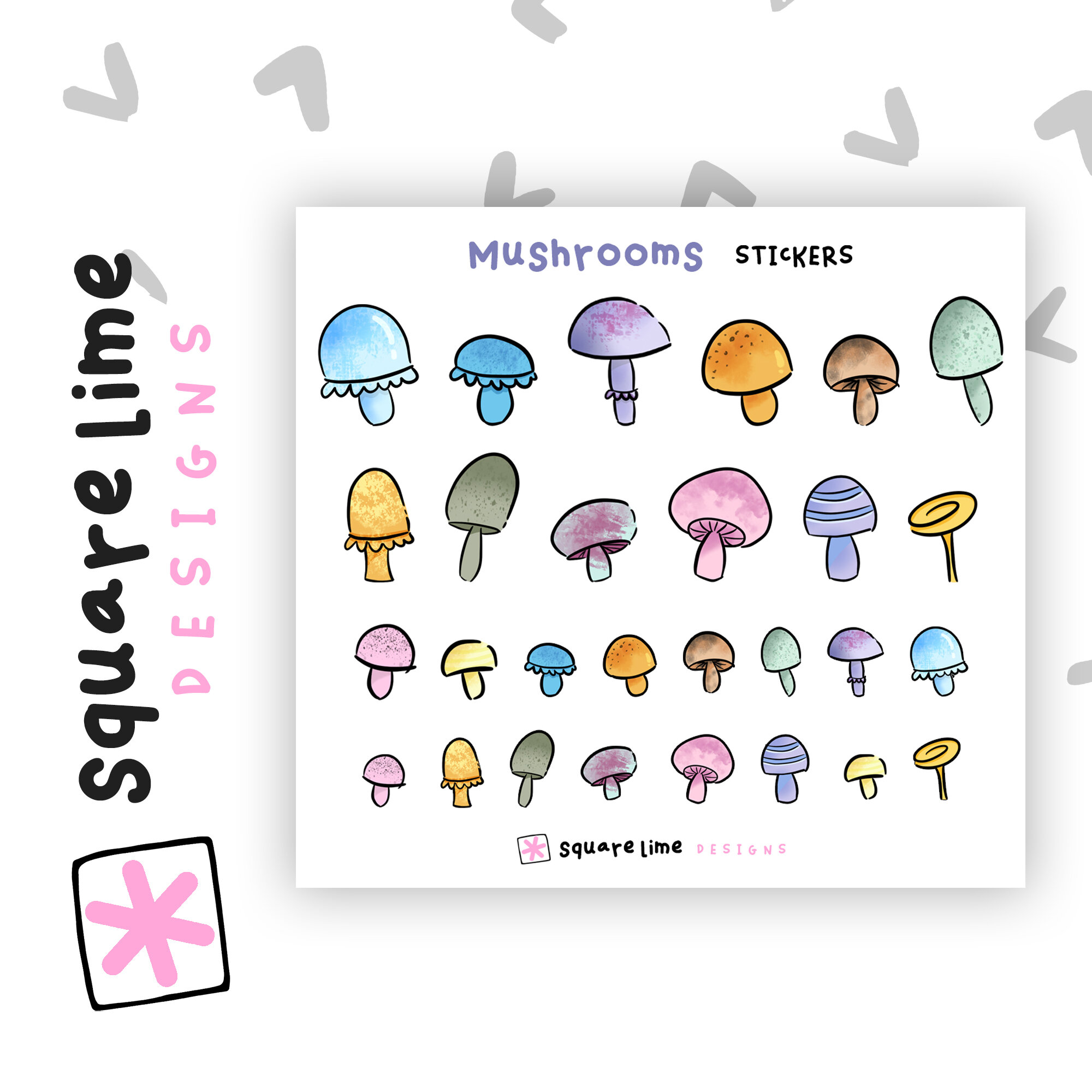
Lastly, the fourth weekly spread of October I decided to use some stickers from my shop to decorate it. I have to say that it is my favourite one of the month! The little mushrooms are so nice and cute, and they add colour to the page without making it overwhelming 🍄
Cute Mushrooms Mini Stickers! 🍄
SUPPLIES USED:
Tombow Dual Brush Markers (N65, 946, 192, 993, 603, 373, 158, 025, 815, 443, 528, 533, 493)
So, these are the 4 weekly layouts for October. I hope you liked this post and that you found some inspiration for your own weekly layouts. If you liked the theme and you'd like to recreate it, please send me some pictures. I'd love to see your pages!! You can always contact me at squarelimedesigns@gmail.com
Bullet Journal Ideas: 4 Weekly Spread Layouts for May 2019
Hey there everyone! ✨
One of the things that I love to do in the beginning of each month is to plan my weekly spreads, so that I have them ready to fill in all the information, appointments etc. That way I save time and I have space to plan everything. The theme for May is 'Cacti' and you can see how I've setup my bullet journal for the month in this post.
For my first weekly spread I decided to use a simple and clean horizontal layout, and add a small little cactus in front of each day. I love how individual each one looks and how unique with the different lines. As you can see, instead of the prickly lines that you usually associate with a cactus, you can use different shapes and get the same result. You can use vertical lines, zigzag lines, circles, rectangles, x’s or twirly things etc. It’s all up to you and your imagination!
For the second weekly spread I chose one of the layouts that I use almost every month. I love the way the space is arranged in this layout and how much room you have to add your to-do lists and your appointments. In the notes section I’ve added a very cute cactus with a quite big moustache!!! 🌵 (* If you really like him, you can find him as part of my cacti sticker set in my Etsy shop 😉)
For the third week of January I used another weekly layout that I use very often. It uses the space in a similar way as the previous one. Again I used green shades for my colours and in the notes section I’ve added a cute and cheeky little cactus. Very clean and simple layout that I can’t wait to use.
Lastly, the fourth weekly spread of May is one of the most simple weekly spreads that I have as a go to one, when I don’t have enough time. Each page is separated into 4 sections - one for a day of the week, and it leaves one more section for the notes. I’ve added a cactus in the middle of the lines to tie up the layout with the theme. Very simple and easy to do.
So, these are the 4 weekly layouts for May. I hope you liked this post and that you found some inspiration for your own weekly layouts. If you liked the theme and you'd like to recreate it, please send me some pictures. I'd love to see your pages!! You can always contact me at christina77star@gmail.com
Bullet Journal Ideas: 4 Weekly Spread Layouts for February 2019
Hello everyone! ✨
I’m back with my weekly spreads for February. As you all know by now, I love to plan all my weekly spreads in the beginning of the month , so that I have them ready to fill in all the information, appointments etc. that I need. That way I save time and I have space to plan everything.
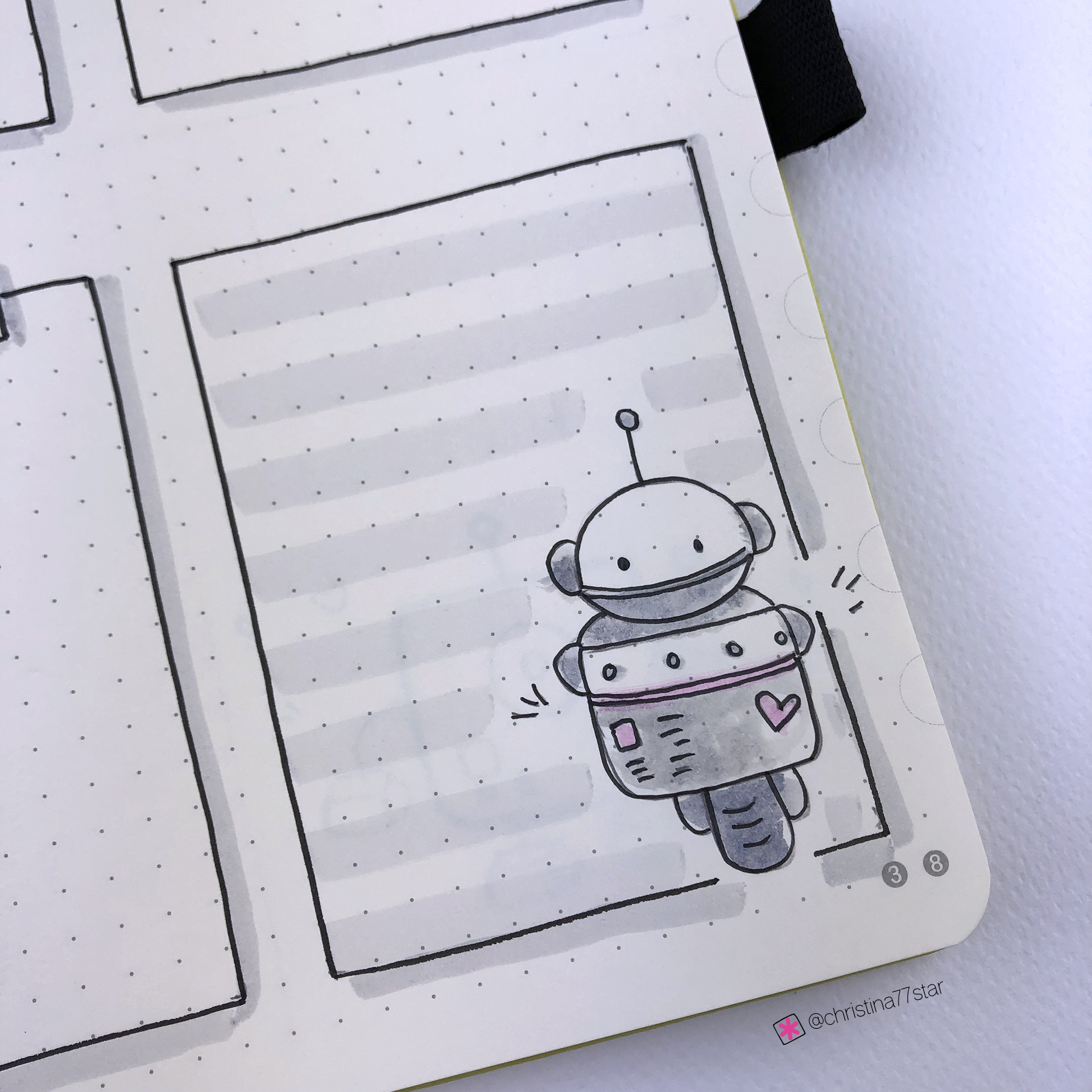
The theme for February is 'Robots' and you can see how I've setup my bullet journal for the month in this post, or you can watch the video here.
For my first weekly spread I decided to create some floating boxes for each day. I also added a box for my weekly notes that is decorated with that cute little robot on his motorbike! As you can see, nothing is perfect. I don’t use a ruler any more for my lines and I’m ok with them being a bit wonky…!
For the second weekly spread I used again a similar layout with 4 sections on each page - one for each day of the week and one for notes (as always!). For the days I chose to use a black background to make everything stand out more, and wrote the date with my white pen.
I love how the little robots turned out and I also like the colouring I used for them. I’m always reaching for my pastel colours most of the time, so I thought to use pastel blues and pinks with lots of greys for my robots as well.
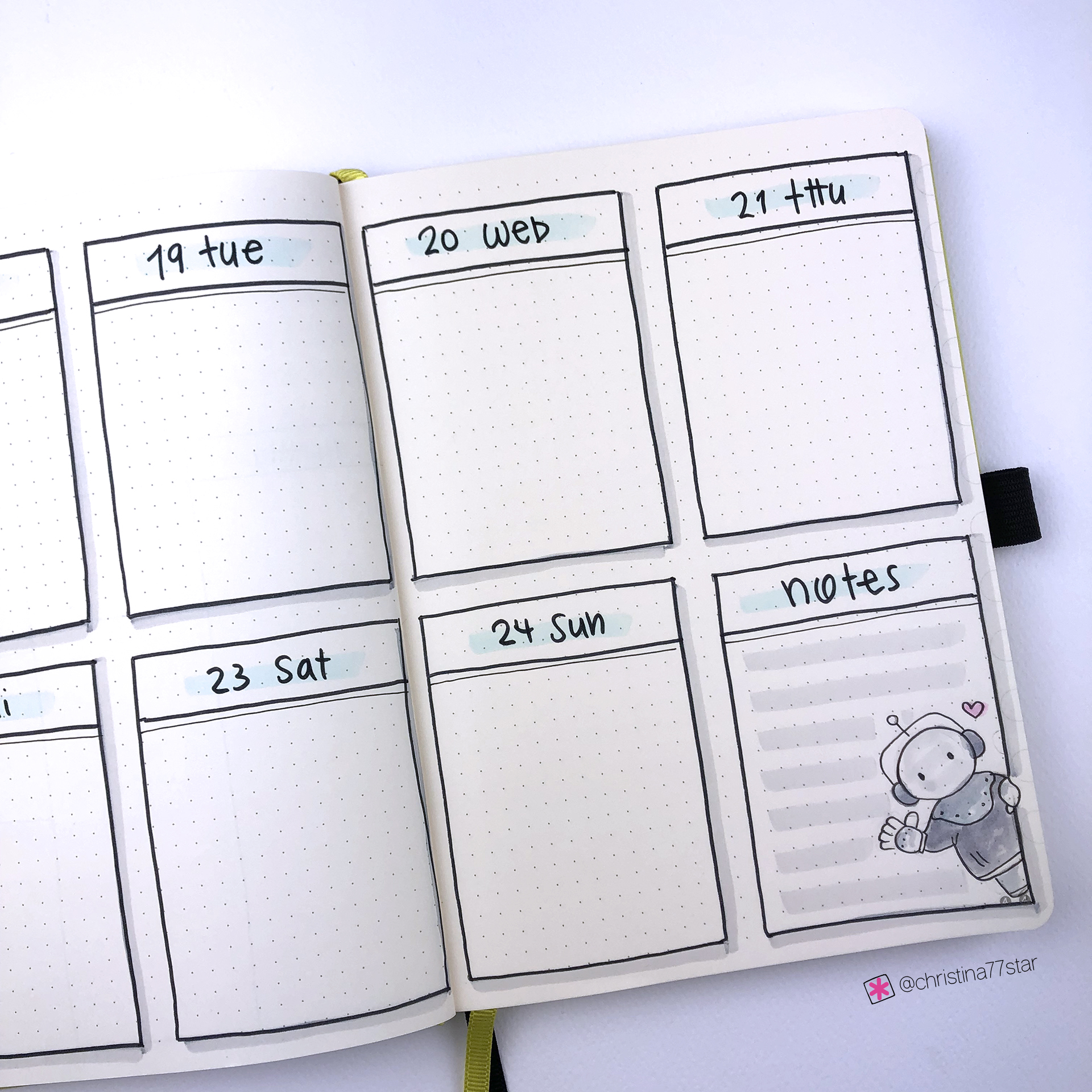
For the third week of February I used one of my favourite vertical weekly layouts. I really like the fact that I have lots of space for my lists and also enough space for any notes or misc things I might need to write down. I’ve sectioned the top part of each column and I plan to write my daily menu there.
Of course, since it’s Valentine’s week I had to decorate the page accordingly. I think the little robot turned out super cute and how can you say no to him!!???
The fourth week of the month has a similar layout with the first one. I love the simplicity of it, that’s why I go back to the same layout again and again. I’ve found what I like and what works for me, so that’s why I have a set of weekly layouts that I use all the time.
I’m super happy with the theme and the way all the weekly spreads turned out, and I can’t wait to start using them.
SUPPLIES USED:
Tombow Dual Brush Markers (673, 452, 451, 800, 491, N89, N75, N95, N15, N45 and N79)
Sakura Gelly Roll White Pen 08
So, these are the 4 weekly layouts for February! I hope you liked this post and that you found some inspiration for your own weekly layouts. If you liked the theme and you'd like to recreate it, please send me some pictures. I'd love to see your pages!! You can always contact me at christina77star@gmail.com
Bullet Journal Ideas: 4 Weekly Spread Layouts for January 2019
Happy New Year everyone! ✨
I’m wishing you all an amazing 2019 full of love, laughter, incredible possibilities and precious moments. This is the time to start fresh, and take this opportunity to plan new beginnings and new ideas! I love January, because it’s the time of the year that I always push myself to try new things, and plan the rest of the year. Of course my bullet journal is always there to help me put my head in order and make planning and organising so much easier for me. 😊
One of the things that I love to do in the beginning of each month is to plan my weekly spreads, so that I have them ready to fill in all the information, appointments etc. That way I save time and I have space to plan everything. The theme for January is 'Coffee' and you can see how I've setup my bullet journal for the month in this post, or you can watch the video here.
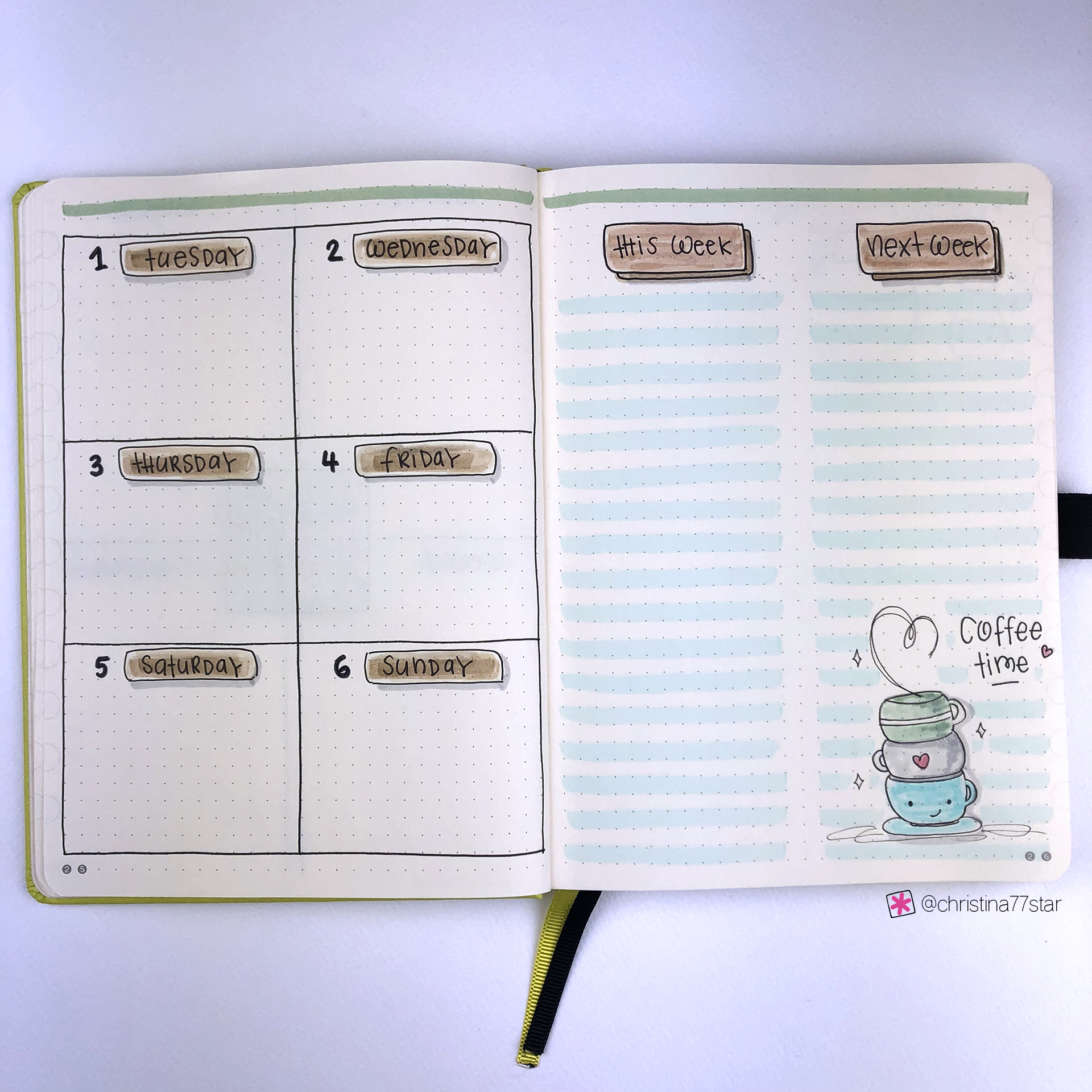
For my first weekly spread I decided to use an older layout, that I used to use in my second bullet journal. I took advantage that I only wanted to add 6 of the 7 days of the week, and that layout is perfect for that. On the right there is enough space to plan and brainstorm for this and next week, which I think is important to have for the first week of the year.
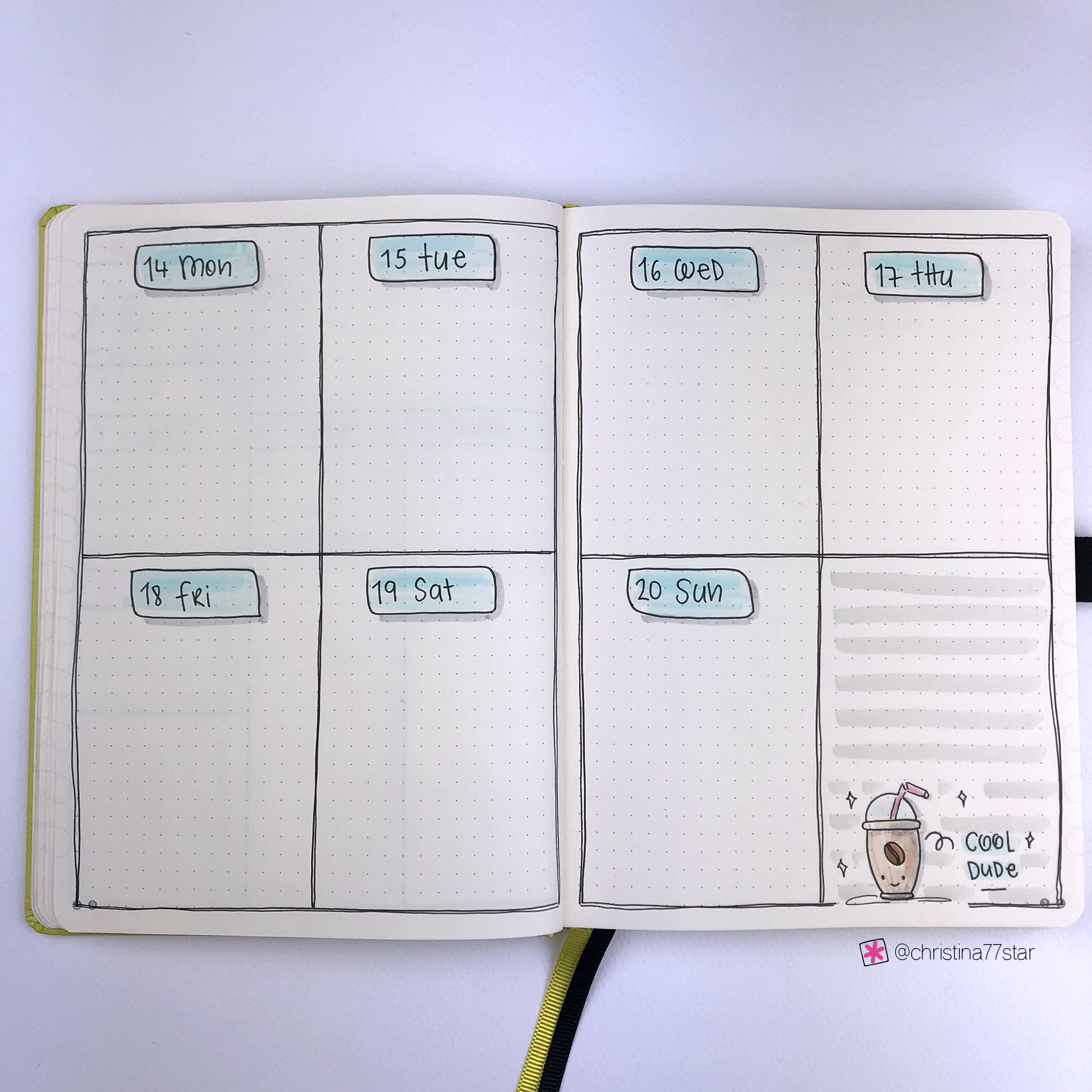
For the second weekly spread I chose one of the layouts that I used in December as well. I love the way the space is arranged in this layout. Also the section above each day with the grey lines can be used for so many things: daily menu, top priority tasks, happy thought, appointments and so on. In December I used it to write down all my self-care tasks that I had for each day, but I think for January I want to add affirmations to set the mood of that day ☺️.
I love how the doodles and the theme of the month turned out! I wanted to add more cute and funny drawings and I think I managed to do that with the cute faces I added on each doodle and the titles I gave to each one.
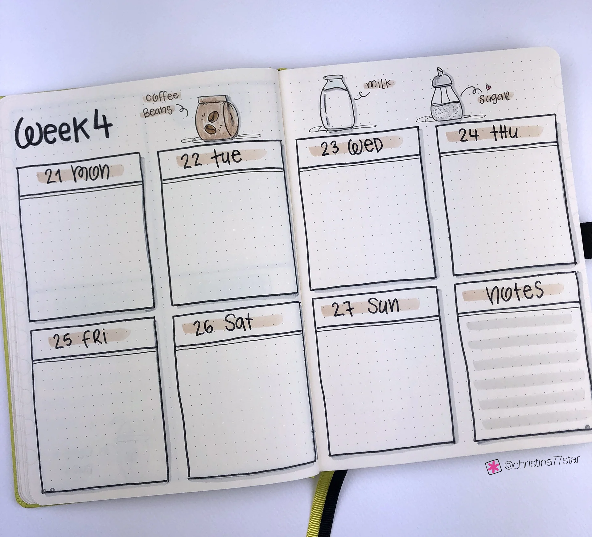
For the third week of January I applied one of my most used weekly layouts. This simple grid that you can separate in any category you want, has saved me many times. It’s so simple to create and still functional. So, if I don’t have time to do fancy and complicated layouts, this is my go to one. ☺️
I decided to add this cool dude as well in my notes section! 😂 Living in Cyprus you get to drink cold coffees most of the time, so I knew I had to include a cold coffee (Frappe) in my spreads too.
I think the fourth weekly spread of January is my favourite one of all! I love the colours, the use of space. And the doodles make it even more adorable! 😍
I seriously can wait to start using it and start planning my day in these boxes!
SUPPLIES USED:
Tombow Dual Brush Markers (947, N15, N89, 977, 451, 452, 772, N75, 942, 992, 990, 192)
So, these are the 4 weekly layouts for January and the first ones of 2019! I hope you liked this post and that you found some inspiration for your own weekly layouts. If you liked the theme and you'd like to recreate it, please send me some pictures. I'd love to see your pages!! You can always contact me at christina77star@gmail.com
Bullet Journal Ideas: 4 Weekly Spread Layouts for December 2018
I love this time of year! Everything is in Christmas and New Year’s spirit. Festive lights are being strung around the neighbourhood, holiday music is playing at my favourite shops, and the season of giving has definitely begun!
December marks a time of reflection while we enjoy all the lights, sounds and smells of the holidays. I really can’t believe that we're in the last month of the year. 2018 is coming to an end, and it has truly been an amazing year. I’m grateful for all the opportunities that were presented to me and all the amazing moments and memories I had the chance to create. But I’m also grateful for all the problems and difficulties that came up as well, because they made me come out of my comfort zone and try harder.
As always one of the things that I love to do in the beginning of each month is to plan my weekly spreads, so that I have them ready to fill in all the information, appointments etc. during the month. That way I save time and I have space to plan everything. The theme for this month is 'Gingerbread Cookies' and you can see how I've setup my bullet journal for the month in this post, or you can watch the video here.
Happy December everyone! 🎄
I love this time of year! Everything is in Christmas and New Year’s spirit. Festive lights are being strung around the neighbourhood, holiday music is playing at my favourite shops, and the season of giving has definitely begun!
December marks a time of reflection while we enjoy all the lights, sounds and smells of the holidays. I really can’t believe that we're in the last month of the year. 2018 is coming to an end, and it has truly been an amazing year. I’m grateful for all the opportunities that were presented to me and all the amazing moments and memories I had the chance to create. But I’m also grateful for all the problems and difficulties that came up as well, because they made me come out of my comfort zone and try harder.
As always one of the things that I love to do in the beginning of each month is to plan my weekly spreads, so that I have them ready to fill in all the information, appointments etc. during the month. That way I save time and I have space to plan everything. The theme for this month is 'Gingerbread Cookies' and you can see how I've setup my bullet journal for the month in this post, or you can watch the video here.
The first weekly spread is the one that I’ve been using for the past few months and I love! I kept it pretty simple with a few Gingerbread Cookies on top and red lines instead of black.
For the second weekly spread I took an old layout that I’ve been using a lot, and made some modifications to change things up and make it even more useful. I added a section for weekly notes at the top and a mini calendar. I made the boxes for the weekend bigger and I also created a section with grey lines for each day. That section can be used in many ways: daily menu, top priority tasks, happy thought, appointments and so on. I haven’t decided yet what I'll use mine for 🤣 but I’m really happy with the result!
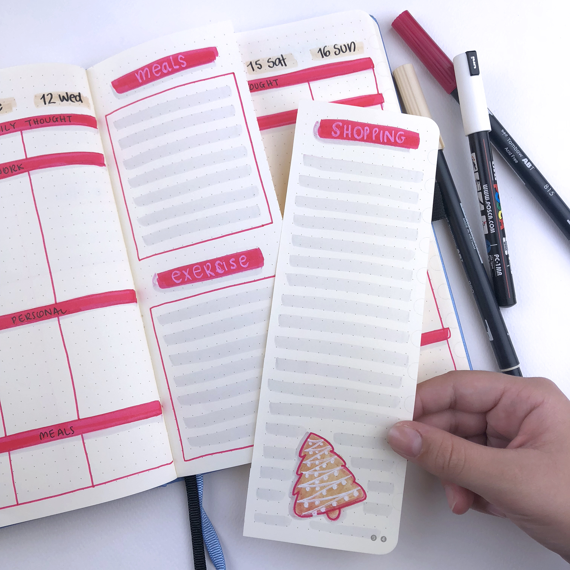
The third weekly spread for December is a dutch door layout. I find this layout so functional and versatile, that I have to use it at least once each month! As I did in November, I used the section of the page that I cut off as my shopping list. That way I don’t waste any paper and it proved to be such a clever thing too, last month! 👏🏻 (you can even use it as your Xmas shopping list 😉)
I used mostly red and grey that adds so much colour and vibrance to the page! I love it! 😍 For the middle page section I created sections for the weekly meal plan and my exercise routine, at the front.
And at the back I added boxes for this and next week’s notes and to-do lists.
The fourth weekly spread is a very simple layout that turns very festive with the colours and the cute gingerbread man! Not much to say here. I’ve used this spread time and time again and I love the simplicity of it. It’s my go to weekly spread, when I don’t have too much time to be creative.
And the last weekly spread of the month is basically the same layout with the 4th one. However, I added less red lines and I created some sections for each day with the grey lines. I also skipped the notes section at the end, and I added the last day of the year, that falls on a Monday…! I wanted to include all the last days of 2018 in one weekly spread and this looks perfect to me!
SUPPLIES USED:
So, these are the 5 weekly layouts for December and the very last of 2018! I hope you liked this post and that you found some inspiration for your own weekly layouts. If you liked the theme and you'd like to recreate it, please send me some pictures. I'd love to see your pages!! You can always contact me at christina77star@gmail.com
Bullet Journal Ideas: 4 Weekly Spread Layouts for November 2018
Happy November everyone! ♥ I feel that the countdown towards the end of the year has officially started! The last two months usually fly by with all the preparations and the planning. Therefore, it’s the best time to focus and to plan the last 60 days of the year in order to make them count and to make sure that you achieve everything you wanted to before the end of 2018!
Happy November everyone! ♥ I feel that the countdown towards the end of the year has officially started! The last two months usually fly by with all the preparations and the planning. Therefore, it’s the best time to focus and to plan the last 60 days of the year in order to make them count and to make sure that you achieve everything you wanted to before the end of 2018!
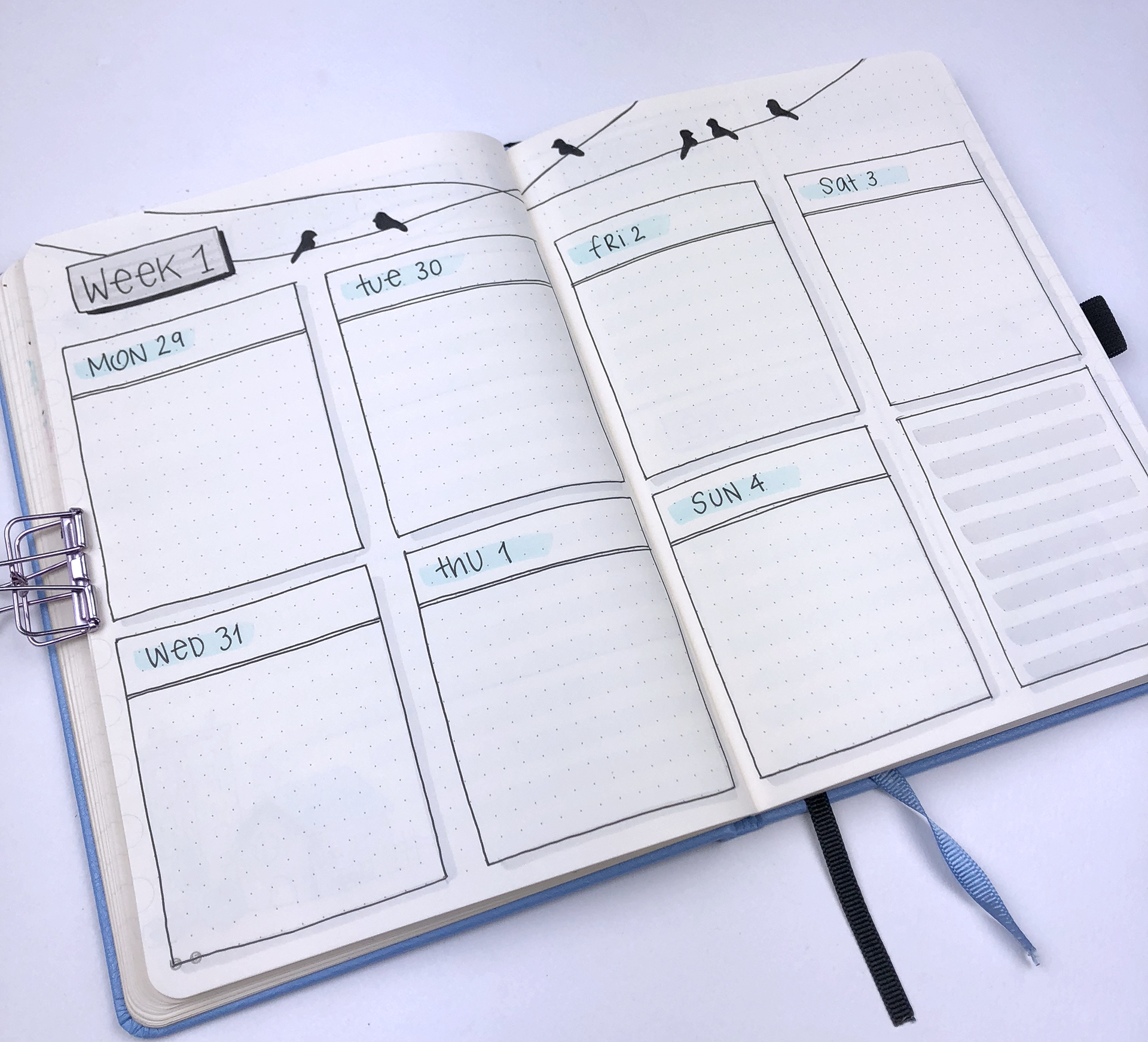
As always one of the things that I love to do in the beginning of each month is to plan my weekly spreads, so that I have them ready to fill in all the information, appointments etc. during the month. That way I save time and I have space to plan everything. The theme for this month is 'November in the City' and you can see how I've setup my bullet journal for the month in this post, or you can watch the video here.
The first weekly spread is one that I’ve used in October as well and I loved, so I thought to create on for November as well. I got inspired for it by the lovely @sheylara_shen who you should definitely check out! ☺️ I made it very simple this time, adding only a few birds at the top of the page to tie it with the them and used light blue and grey for the colouring. I love how simple it looks!
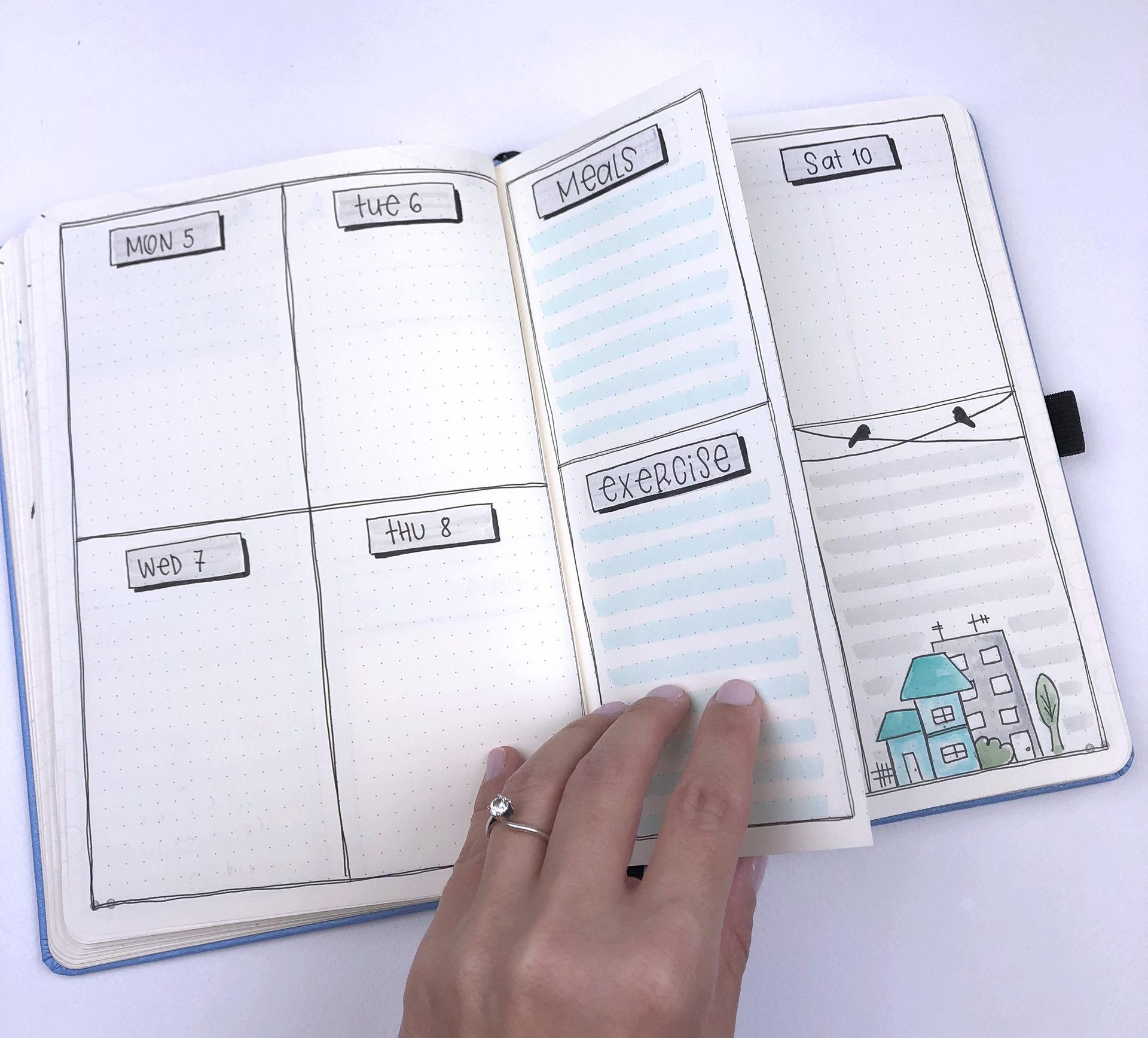
The second weekly spread of the month is again a dutch door one. If you’ve followed me for a while, you’ll know that I love using this layout for my weeklies. I’ve changed a bit the middle section, where I’ve added spaces for my meal planning and my exercise log. I’m trying to lose some weight before the holidays, so this is perfect to keep me focused and to help me plan ahead my meals.
At the notes section I added some grey lines and a few houses to tie it with the theme.
I’ve also made use of the section of the page that I cut off, and turned it into a very handy shopping list that I can now take it with me in my bag when I go shopping! 👏🏻
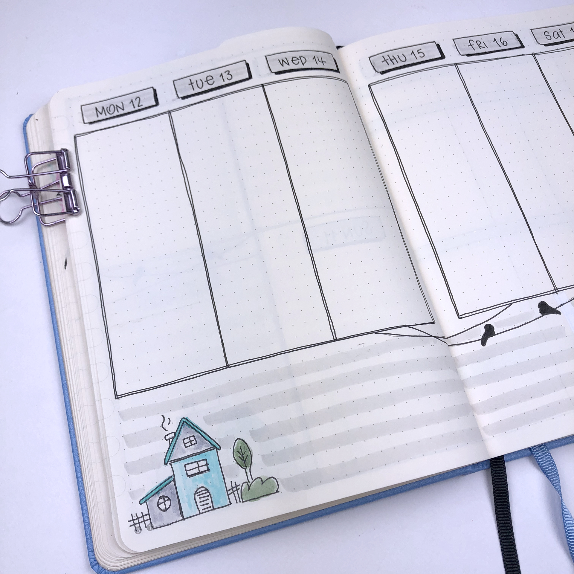
For the third weekly spread I’m using again a vertical layout that I really like to use. It’s simple to create and there’s space for everything and I like to add little details at the bottom section according to the theme each time.
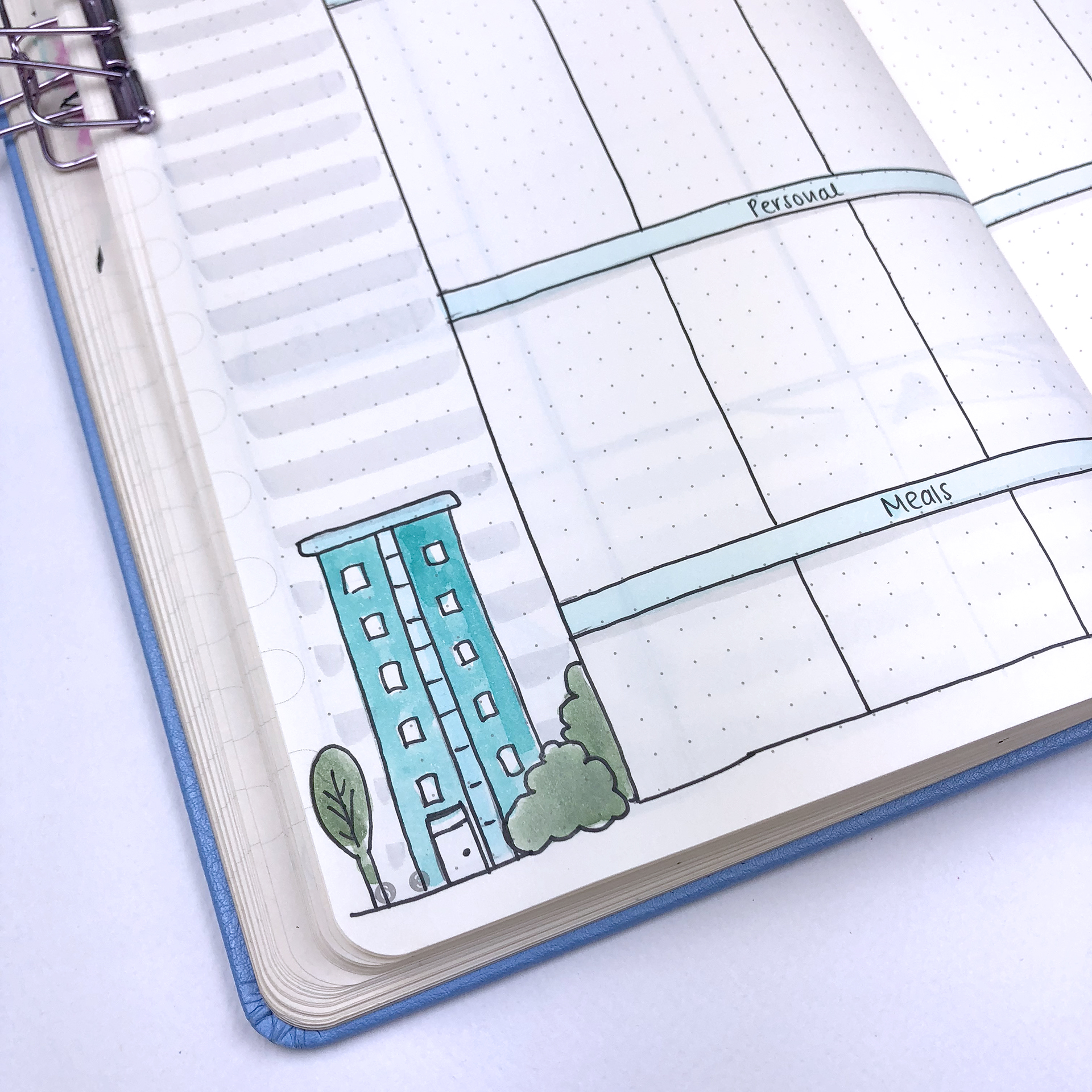
And the last weekly spread of the month is the one with the table layout where you can create lots of sections, according to what you want to plan during the week. And that’s what makes it one of my favourites!
SUPPLIES USED:
Tombow Dual Brush Markers (N95, N89, 451, 373, 158 and 192)
So, these are the 4 weekly layouts for November. I hope you liked this post and that you found some inspiration for your own weekly layouts. If you liked the theme and you'd like to recreate it, please send me some pictures. I'd love to see your pages!! You can always contact me at christina77star@gmail.com
Bullet Journal Ideas: 4 Weekly Spread Layouts for October 2018
Happy October everyone!
I’m wishing you all an amazing month full of planning and organisation 😉 I love when a new month starts, because it gives me the chance to re-focus and start new! October also starts on a Monday, and this is perfect for us bullet journalists! New month, new week and everything fits on the pages like a dream ☺️
As always I like to plan my weeklies for the month in advance. That way I can plan everything properly and make sure that all my appointments and tasks are scheduled.
Happy October everyone!
I’m wishing you all an amazing month full of planning and organisation 😉 I love it when a new month starts, because it gives me the chance to re-focus and start new! October also starts on a Monday, and this is perfect for us bullet journalists! New month, new week and everything fits on the pages like a dream ☺️
As always I like to plan my weeklies for the month in advance. That way I can plan everything properly and make sure that all my appointments and tasks are scheduled. For October the theme is 'Laundry' and you can see how I've setup my bullet journal for the month in this post, or you can watch the video here. For October I had to create 4 weekly layouts.
For the first weekly layout I chose to use again the dutch door system.
I used this layout last month as well and I loved it! So, I thought to use it again for October. I added 2 sections for my meals and my shopping on one side of the middle page, instead of my tracker. As you might have guessed it, the tracker didn’t work again so I’ve given up!!! 😬 I find that when I use any type of tracker I get stressed and upset with myself if I don’t do the things that I’m tracking or if I forget to fill in the tracker. Therefore, no more trackers for me - at least for now…
On the other side I added the sections for this and next week’s notes, as I always do. I find this type of layout really functional and I love the way it turned out!
For the second weekly, I used again the horizontal layout I saw from @organisedhustler . This is one of very few horizontal layouts that I really like to use, and the reason for that is that little line in the middle of the each day. It helps me to create 2 different to-do lists and separate my personal and work tasks! Love it!
The 3rd weekly spread is my most favourite of the month! I love the space, the functionality, the fact that I have room to decorate it the way I want… everything! I got inspired by the lovely @sheylara_shen ☺️ If you don’t know who she is, then you must go and check her out! I love her pages and her doodles! 😍
For the last weekly spread of the month I chose a layout that I use almost every month! I like the simplicity of it, plus the pastel colours and the doodles make it look so cute! The only thing that bothers me is that wobbly line…. 😬😫 I’ve decided for some time now not to use a ruler for my bullet journal and to embrace mistakes and wobbly lines. However, that line between Thursday and Friday is way more wobbly than I can handle, and I was ready to erase it and redo it. But, I decided to keep it and to be reminded that it’s ok not to have absolutely perfect pages. 😉 So, the line stays!
SUPPLIES USED:
Faber-Castell PITT Artist Pen in M, S, F
Tombow Dual Brush Markers (703, 761, 620, 243, 673, 553, 491, N75, 192, 942, 990, N89, and 992)
So, these are the 4 weekly layouts for October. I hope you liked this post and that you found some inspiration for your own weekly layouts. If you liked the theme and you'd like to recreate it, please send me some pictures. I'd love to see your pages!! You can always contact me at christina77star@gmail.com
Bullet Journal Ideas: 5 Weekly Spread Layouts for September 2018
I think I say the same thing in the beginning of each month, but seriously I can't believe it's September already! 2018 is literally flying by! I don't know about you, but I love this time of year. My kids are getting ready for school, and I think I'm more excited about it than them! I love buying stationery and school supplies, and getting their school bags ready. I also like it because as in January, it feels like a new start, a new beginning, within the year. It's another chance to re-focus and plan and schedule the last few months of 2018.
I think I say the same thing in the beginning of each month, but seriously I can't believe it's September already! 2018 is literally flying by! I don't know about you, but I love this time of year. My kids are getting ready for school, and I think I'm more excited about it than them! I love buying stationery and school supplies, and getting their school bags ready. I also like it because as in January, it feels like a new start, a new beginning, within the year. It's another chance to re-focus and plan and schedule the last few months of 2018.
As always I like to plan my weeklies for the month in advance. That way I can plan everything properly and make sure that all my appointments and tasks are scheduled. For September the theme is 'Message in a bottle' and you can see how I've setup my bullet journal for the month in this post, or you can watch the video here.
September starts on a Saturday, and for this month I had to plan 5 different weekly layouts.
For the first weekly layout I chose to use a dutch door system.
I created the layout as normal, but I cut the middle page vertically in half, to use for my tracker and my planning for this and next week.
I find this type of layout really functional and I am going to be using it again in the future for sure.
This was the last page in my 4th bullet journal. The rest of the weekly spreads were created in my brand new one! I've chosen a Dingbats notebook for my 5th bullet journal, and I'm so excited to start using it. You can see my review and pictures of the notebook in this blog post.
For the second weekly, I decided to use a horizontal layout. If you've been following me for a while you know that I prefer the vertical layouts most of the time. I find that I can use the space better and I can create to-do lists for both personal and work related tasks. With a horizontal layout I find that I can't separate things. But I saw this layout by @organisedhustler and I decided to give it a go.
The line in the middle helps me to create 2 different to-do lists and separate my personal and work tasks! Love it!
The 3rd weekly spread is a layout I use every month. I decorated it according to the month's theme, and the only change I've made is that I extended a bit the space for my to-do lists.
Another layout that I use a lot for my weeklies is the one bellow. I love the sections that separate the vertical lists into categories. And the best part is that you can add as many sections as you want and choose the categories that work for you.
For the last weekly spread of the month I chose another horizontal layout! I like the boxes and the simplicity of it, plus I added a notes section. I might add some vertical lines, like I did in the 2nd layout, to create sections for my to-dos.
SUPPLIES USED:
Faber-Castell PITT Artist Pen in B, S, F
Tombow Dual Brush Markers (673, 491, 990, 533, 553, N89, N95, 451, and 800)
So, these are the 5 weekly layouts for September. I hope you liked this post and that you found some inspiration for your own weekly layouts. If you liked the theme and you'd like to recreate it, please send me some pictures. I'd love to see your pages!! You can always contact me at christina77star@gmail.com


