Instagram Challenge: #doodlewithusinmarch2018
I'm excited to announce our Instagram Challenge for the month of March! 👏🏻
It's the #doodlewithusinmarch2018 Instagram Challenge created by me and Alexandra (from @alexandra_plans).
It's going to be 31 days of doodles that will hopefully get you to be creative and have fun! The theme of March's prompts is 'Flowers'. I seriously can't wait to start drawing!
As we did before, all the doodles are part of one big comprehensive picture. Imagine each day to be one piece of the puzzle. So, at the end of the month you will have one big doodle picture! :)
If you decide to follow this way, you'll have to create a table with 5x6 + 1 boxes and you shouldn't add the days on the top. You can also make the boxes and dates in pencil, if you don't want the lines to obscure the end result. It's totally up to you.
Of course, if you prefer to draw the doodles in the traditional way, that's absolutely fine as well. The important thing is to have fun!
You can also download a free printout with the daily prompts here.
If you want to join us then:
- Follow me (Christina) @christina77star and Alexandra @alexandra_plans over on Instagram.
- Download the prompts below.
- Draw something according to the day's prompt, take a photo of it, and share it with us on Instagram.
- Don't forget to add the hashtag #doodlewithusinmarch2018 and spread the word.
- Everyone is welcome!
We're excited to see what you'll share!
Thank you for joining in!
How do you transition from one month to the next in your weekly spreads
Starting a bullet journal can be a bit intimidating to some of you. Up until now you have been used to having a planner all set up for you already, but now you have to put the work, and you can create your own layout. So, you might find yourself at times staring at the empty pages of your journal wondering what to do next.
One of these times might be when you transition from one month to the next and you don't know how to set up your weekly spreads.
How do you do your weekly spread when the month changes mid-week? On which monthly layout do you add that particular week? Do you repeat it for the next month?
These are some of the questions I get asked, so today I thought I'll show you a few ways you can deal with this dilemma and choose the one that works for you.
Starting a bullet journal can be a bit intimidating to some of you. Up until now you have been used to having a planner all set up for you already, but now you have to do all the work, and you can create your own layout. So, you might find yourself at times staring at the empty pages of your journal wondering what to do next.
One of these times might be when you transition from one month to the next and you don't know how to set up your weekly spreads.
How do you do your weekly spread when the month changes mid-week? On which monthly layout do you add that particular week? Do you repeat it for the next month?
These are some of the questions I get asked, so today I thought I'll show you a few ways you can deal with this dilemma and choose the one that works for you.
1. The month with more days for the week wins
As the title suggests, when you are about to create the layout for the last week of the month, you can check and see how many days of that week belong to that month and how many days belong to the next month.
The month with the most days wins, and you can then add that weekly spread in the winning month's layout.
So for example, the above weekly spread was for the last week of July and the beginning of August. As you can see August is clearly the winner so this spread should go to the August layout.
2. Go with the flow
This way suggests to go with the flow. That means that no matter how many days there are in each month or when the new month begins, since the week has days of the current month in it, then it should go in that month's layout.
So in this case, even though there are only 2 days of August in this weekly spread, it will still be added in the August layout. That way, you don't have to count and make things more complicated. Regardless of the month you continue your weekly spreads as normal.
3. Create shorter 'weeklies'
If you want to be more strict with your weekly layout and the days that belong to each month, there's also the option to add only the days of that particular month on your weekly spread. What that means is that you create shorter 'weeklies' with only the days of the current month in them.
So for example, if May ends on a Wednesday, then you can create a mini weekly spread with the last three days of May (Monday-Wednesday) on one page, and then the rest of the week you can add it in the June layout. So, you are essentially creating two partial weekly spreads.
Of course you also have the option to skip the weekly spreads altogether for the last days of the month and do only daily spreads.
The bullet journal system gives you the opportunity to choose which way suits you best. You can also try one method one month and if you see that it doesn't work, you can change it around the next month. The important thing is to not stress about it, and just plan however feels the most useful to you.
Me personally, I prefer the go with the flow option. But there have been months where I have also followed option no. 1.
How do you transition from month to month with your weeklies? Are you using any of the above choices? Do you do things differently? If so, let us know in the comments below.
The Craft Planner Review
Hey there everyone! It's been a while...! But I'm happy to report that I'm finally all settled in the new house, and I can't wait to start creating again ☺️
In today's blog post, I'd like to review the Craft Planner for you. Back in July, I was asked to review the Craft Planner and I really liked the way this planner helps you to manage your projects. At the time the planner was not available yet, and I only had some printable pages to play with. But now I have the finished product in my hands, and I'd like to review it properly for you.
I chose the Craft Planner A5 Limited Edition in Coral Blue. It is actually a very light blue-grey colour and the cover feels like fabric. I really like the way it looks - very sophisticated.
Inside the planner you also get some coloured dot stickers that you can use to colour code in your planner, and a pager marker with some nice suggestions to plan your day and manage your time.
The planner comes with a light grey elastic band that is very sturdy.
I like the attention to detail with all the shiny letters at the front and the back of the notebook.
I also like the shiny finish of the pages on the side, that makes it look so cool when it's closed.
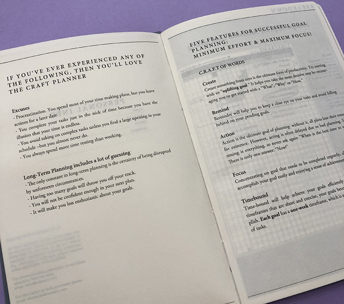
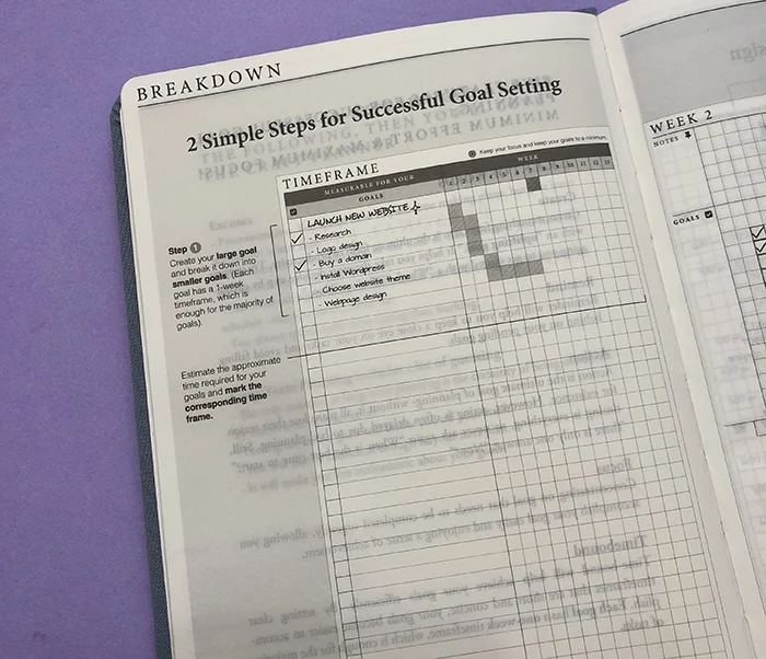
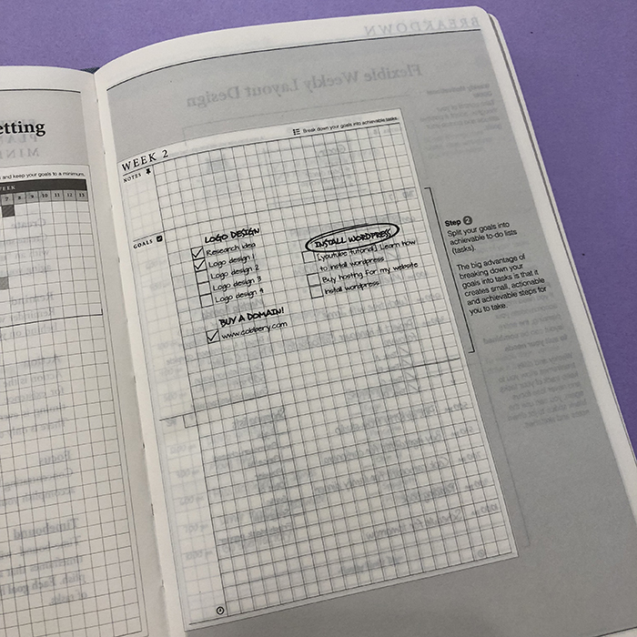
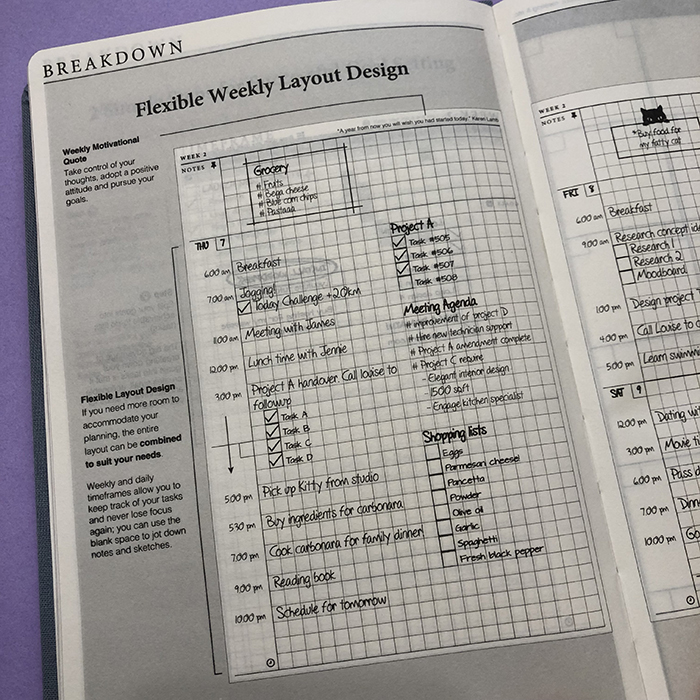
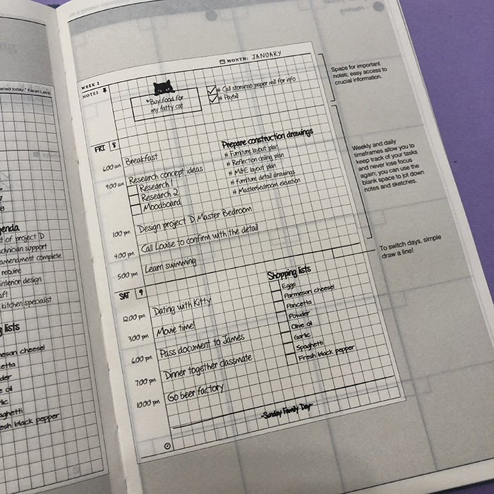
There are 4 pages of break-down demo in the beginning of the notebook, where it shows you exactly how to use this planner. You can scroll through the pictures above to see them properly.
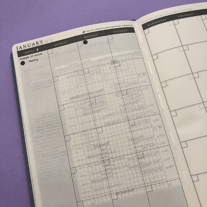
The first section of the notebook consists of 24 pages with the 12-Month Calendar, which is undated. I always like to have a month at a glance section, where I can plan the whole month at once and have a clear view of what I have to do each day. Also, note that the weeks start from a Sunday for this layout.
Then you get 4 pages of 52-Weeks Timeframe Goals Checklists. I really like this idea, where you can break down your goals / projects into smaller steps and allocate each one on specific weeks. That way you can totally manage your projects and stay on top of them.
The last part of the notebook is 208 pages of 52-Weeks Planner, which is again undated. There are sections for your notes and goals, and then you can start planning your days.
At the back of the planner you get an expandable inner pocket, which I always find very useful for stickers or little notes and stuff.
You also get 2 bookmakers in different shades of grey, that you can use to mark the pages you want in your notebook.
Features
- The planner comes in A5 size (5.8" x 8.4”), with a luxurious cover made form premium fabric.
- It comes with cream lightweight paper, 70 gsm
- 2x Bookmarkers (0.35cm width)
- It lays flat and allows seamless writing on every page.
- Apart from the Coral Blue colour, it also comes in Obsidian Black and Forest Pine.
I gave the planner a test drive, where I planned and colour coded one of my days. I used my most used pens on this page, because I wanted to test the quality of the pages and see if there is any ghosting or bleeding. I even used a fountain pen (see the 'stay focused' phrase at the bottom).
As you can see there is quite a bit of ghosting, but no bleeding through.
I really liked the format and the system of the Craft Planner. Future planning and project planning with the bullet journal can be a bit tricky. And all in all I'm really happy with this notebook.
The things that I would like it to have to make it even better would be:
- Index Page in the beginning of the notebook. Since using my bullet journal, I like to know where everything is and I tend to archive all my notes and planners.
- Numbered Pages. Again, it's nice to be able to refer to a page without adding any markers.
- Better quality paper. I find this paper to be very thin and see through, so I believe that a thicker and better quality paper will take this notebook to the next level.
- Extra pages at the end of the notebook. I always like to keep lists of ideas and notes for my projects, so any extra pages is always nice to have.
You can get a free digital version of the Craft Planner here, to try out this system for yourself before you buy. If you want to get your own planner you can visit their website. Right now they are having a sale and they also offer free international shipping!
Have you heard of the Craft Planner before? What do you think of it?
Plan With Me: My February Set Up in my Bullet Journal
February is almost here and I'm all set up in my Bullet Journal already! Yay!
We're almost done with the move as well, so I can't wait for the next month to come, in order to finally start working on my projects. And since I don't have as much time as before, I decided to keep the layout more simple but still have a theme for the month.
Also, there won't be any videos this month I'm afraid because all my equipment that I use for filming are already packed up 😬
So, here's how I've set up my bullet journal for the month of February:
The first page as always is the front page of the month with my little penguin calendar.
You can find the 2018 Penguin Calendar in my Etsy shop.
You can print and use it as normal calendar, but what I like to do is to print it on a sticker paper, cut it to size and add it straight on the page. I like to use a ruler to make sure the sticker goes on straight and that there's no bubbles..
Moving on to the next spread which is my month at a glance. As I mentioned before, I prefer the grid layout so that's what I did again.
As you can see the theme I chose for this month is inspired from Valentine's Day and it's full of hearts and different shades of pink 💕
On the right of the calendar I have a section for all the things/events I want to remember to do this month as well as for next month.
Moving on to the next page and the goals and general to-dos for the month.
I created boxes for the 4 categories - personal, family, home, and work. I usually make a list of all the goals I want to achieve during the month for each one of those categories, and I visit this page every time I do my weekly spread, to see if I can add some of those goals in that week's list of to-dos.
The next page is a spread for notes that I create every month, where I can add anything I want. One of the most functional pages of each month, for sure!
The next two pages have to do with my exercise and diet. Last year I neglected my body a lot, and I wasn't paying attention to what I was eating most of the time. Also, I skipped exercising by finding various excuses all the time... So, this year I decided to take control of my body, lose the extra kilos that piled up in 2017, and be healthier and stronger. So, after the move, there are no more excuses! 😬
On the left hand page there is an exercise log, where I'll write exactly what I do each day. This helps me to see how many days I've exercised each month and what type of exercise I did the most.
The next page has to do with my diet and it has a list with lots of meal ideas for breakfast, lunch, dinner and snacks. I find it easier to keep up with a certain diet, if there is a list of simple and healthy options for me to choose. Pre-planning my meals for the week is a must, if I want to stay on track and lose that weight.
The last page I created is the first weekly spread of the month. I decided to use a very basic layout with no trackers or anything like that. Simply the to-dos for each day and a section for notes.
And that is one more month planned in my bullet journal. Have you finished your setup for February? What theme did you choose for this month? Let. me know in the comments below.
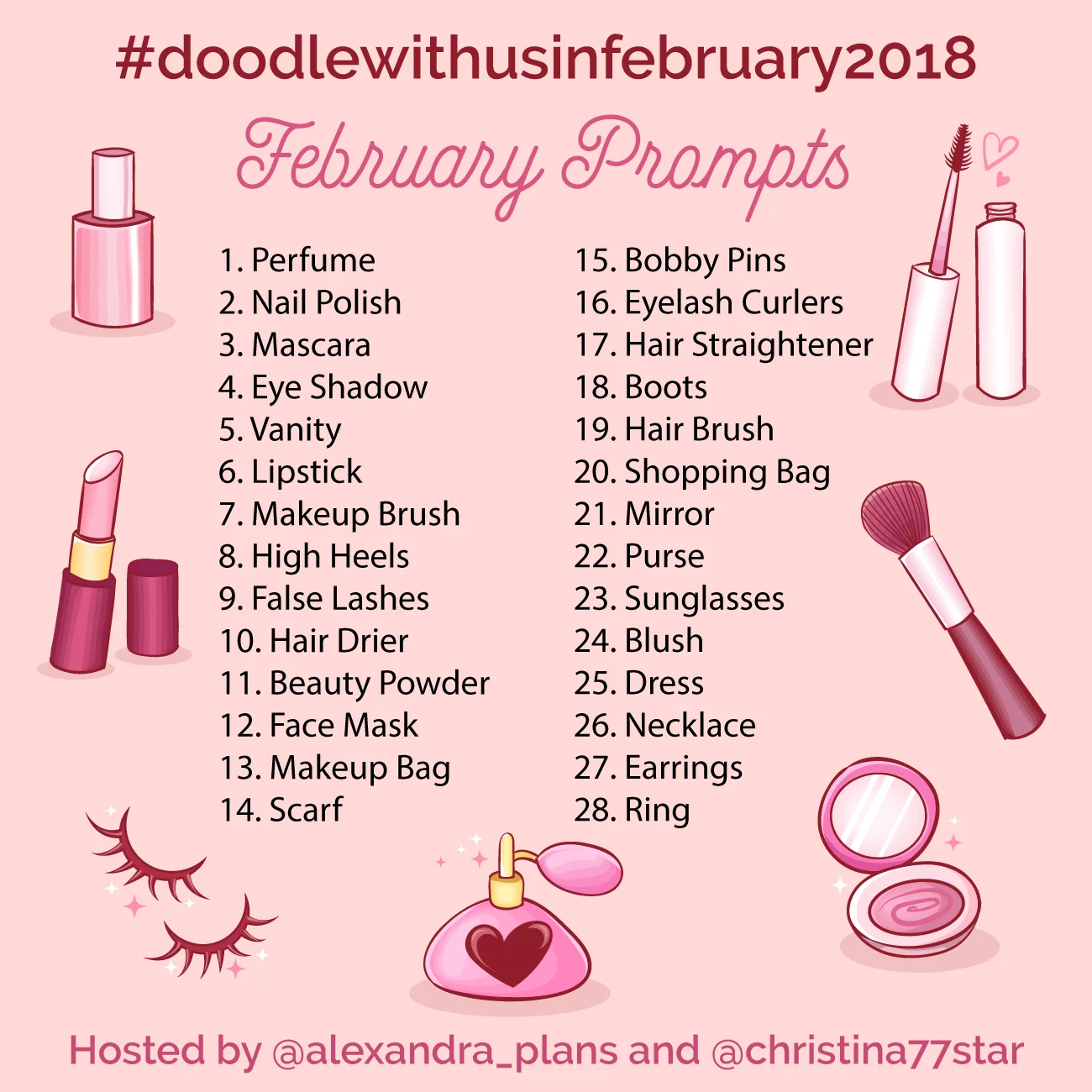
Instagram Challenge: #doodlewithusinfebruary2018
I'm excited to announce that after a short break, our Instagram Challenge for the month of February is back! Yay!!! 👏🏻
It's the #doodlewithusinfebruary2018 Instagram Challenge created by me and Alexandra (from @alexandra_plans).
It's going to be 28 days of doodles that will hopefully get you to be creative and have fun! The theme of February's prompts is 'Makeup and Fashion'. I seriously can't wait to start drawing!
As we did before, all the doodles are part of one big comprehensive picture. Imagine each day to be one piece of the puzzle. So, at the end of the month you will have one big doodle picture! :)
If you decide to follow this way, you'll have to create a table with 4x6 + 4 boxes and you shouldn't add the days on the top. You can also make the boxes and dates in pencil, if you don't want the lines to obscure the end result. It's totally up to you.
Of course, if you prefer to draw the doodles in the traditional way, that's absolutely fine as well. The important thing is to have fun!
You can also download a free printout with the daily prompts here.
If you want to join us then:
- Follow me (Christina) @christina77star and Alexandra @alexandra_plans over on Instagram.
- Download the prompts below.
- Draw something according to the day's prompt, take a photo of it, and share it with us on Instagram.
- Don't forget to add the hashtag #doodlewithusinfebruary2018 and spread the word.
- Everyone is welcome!
We're excited to see what you'll share!
Thank you for joining in!
How to keep your Collections separate from your Daily Spreads in your Bullet Journal
There's quite a few people that don’t like to mix their dailies and weeklies with all the other collections that they create in their bullet journal, and that's one of the issues they have with this planning system.
And even though bullet journaling is a planning system that shows you how to create your own planner one day at a time and to add spreads and collections as you go along, I have to admit that even for me, there are times that I would prefer to organise my pages in sections and categories instead.
So, here are some ways that can help you to overcome this issue:
1. START BACKWARDS
You can simply start and place your collections and various spreads you want to keep separate from your daily and monthly planning, at the back of your notebook and work from the back forwards.
This can be done either by having the notebook as normal and create as you go along, or you can flip it upside down and start creating that way. It all depends on what you prefer.
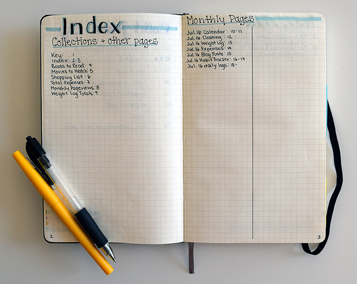
You can still use the index to archive your entries, so that you know where everything is. You can also choose to have a separate Index page for your spreads and collections, like Katie does with her Index Page. As you can see, she has one page dedicated to all the collections she creates and the other page to write down all the monthly entries.
CONS:
Some people might find this way a bit awkward, since they're not used to writing from the back to the front.
2. SEPARATE YOUR NOTEBOOK
You can choose to separate your notebook from the very beginning, and start adding all your collections at the last 1/3 of your bullet journal. This is based on how many pages on average you use for your daily planning and how many you use for your spreads and collections.
You can use your page markers or a separate tab to know where the collections part starts.
CONS:
You might end up having used up either one of the sections (i.e. your daily/weekly spreads or your collections part), while you have more pages left on the other section of the notebook.
3. USE A DIFFERENT TYPE OF NOTEBOOK
You can use a disc bound notebook or a ring binder notebook.
That way you can create sections and move around your pages as many times as you want. You can also keep the same collections and spreads and just change the daily / weekly / monthly pages as you go along. That way, you don't have to recreate your spreads every time you change a notebook.
There's lots of this type of notebooks online. I personally have used and love the William & Hannah notebook and the Jane's Agenda one, and I totally recommend them both.
CONS:
I’m talking more about the pros and cons of this type of notebook in this blog post.
4. USE TWO DIFFERENT NOTEBOOKS
I know some people might find this weird, but you can use 2 different bullet journals - one for your daily planning and one for your Collections and spreads.
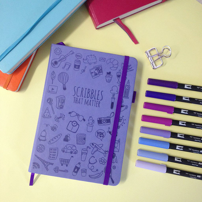
And even though this might not be practical for some, it does provide a solution to this problem, especially if you want to keep using bullet journal notebooks like the Leuchtturm1917 or the Scribbles That Matter ones.
CONS:
Having to carry around 2 notebooks instead of one.
Does mixing your day to day planning with your collections bother you? What do you do about that? Do you find any of the above solutions helpful?
Mint Printcess Notebook Review
Hello, friends and Happy New Year!
This is the first blog post for 2018! I am so excited for the new year and all the amazing opportunities and experiences it's going to bring. I hope you had a good time during the holidays, and that you took the time to be close to your family and loved ones. That's exactly what I did and I'm so grateful of all the lovely moments and memories we created during that time.
Today's review is about a bullet journal notebook by Mint Printcess on Etsy. I always like to test and review bullet journal notebooks, so when I was contacted to do a review for Mint Printcess I said yes straight away.
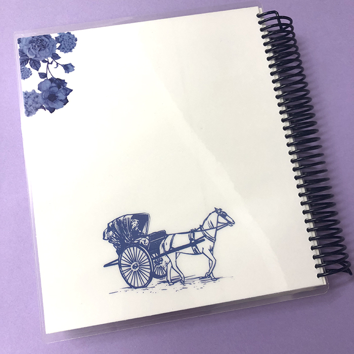
What I noticed the minute I checked her Etsy shop, was the variety of covers she's offering. I had to choose from 114 different designs! That took me a while for sure! But I love the one I've chosen and the best part was that I could personalise the cover too. So, I added my name, but of course you can add anything you want - your word of the year, your business' name etc. The design I chose is called Selena and has these beautiful dark blue-purple flowers.
The cover is made of heavy card stock laminated with 10 mil laminating pouch, making the front and back, not only sturdy but also waterproof.
The spiral coil is plastic and you can select between 3 colours: Mint, Navy Blue and White. I chose the Navy Blue one and I really like how it matches the notebook.
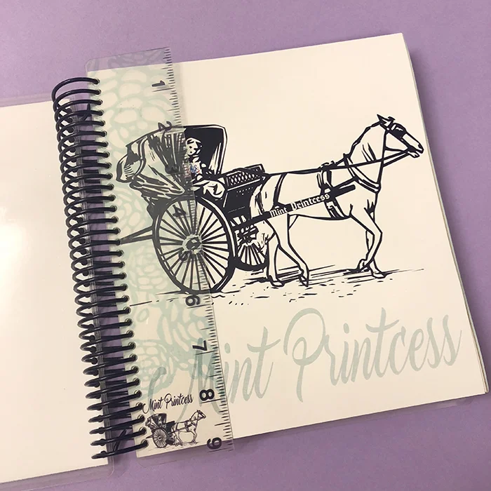
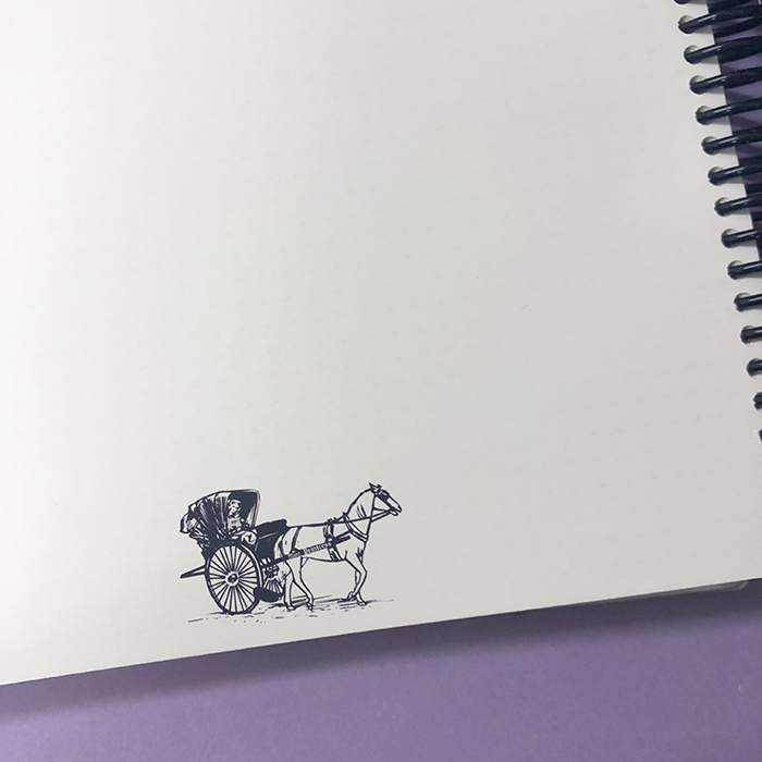
When you open the notebook you have a page with the Mint Printcess Logo, which I think is adorable and a plastic ruler that is retractable and can be used as a page marker as well.
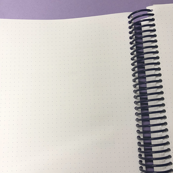
Each notebook has 280 pages of 70 lb high quality paper (140 sheets). It's size is 8.5" x 7.5" and on each page you get 43 dotted lines vertical and 37 dotted lines horizontal. The pages are not numbered, and they feel really nice and smooth.
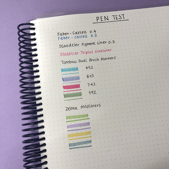
When I did the pen test at the back of the notebook, I was amazed with the result. I tested all the pens and markers that I use on a daily basis and you can hardly see any ghosting at the back of the page. So, I really really like the quality of this paper!
Even though I'm used to the A5 size of my previous bullet journal notebooks, I really like how much bigger this notebook is from my other ones. But it's not as big as an A4, which is really difficult for me to take around in my bag, so that's great.
The other thing I love, is that you can choose different coloured pages and you can totally customise your notebook. There are 8 different colours to choose from. There is purple, pink, kraft and blue which come in 70 gsm, and white, ivory, light blue and green which come in 80 gsm.
I think it's nice to use different coloured pages to section your notebook, or to colour code different categories or collections in your bullet journal.
I love the attention to detail and how well made this notebook is. I think it's an amazing notebook to have at school, or to use it to start creating your bullet journal in it. If you like spiral coil notebooks, then I would definitely recommend it.
Make sure to visit the Mint Printcess Etsy shop to check out all the lovely designs she offers. Do you use a spiral coil notebook as your bullet journal? Let me know in the comments below.
Plan With Me | January 2018 Bullet Journal Setup
I can't believe that 2017 is almost over! That's crazy! It has been such an amazing year for me, so I'm sad to see it go. But I'm ready for 2018 and all the good stuff it's going to bring :)
And since it's the end of the month, I have to set up my bullet journal for January. I'm really excited because I'm finally going to start using my lovely Scribbles That Matter notebook! Yay!
I can't believe that 2017 is almost over! That's crazy! It has been such an amazing year for me, so I'm sad to see it go. But I'm ready for 2018 and all the good stuff it's going to bring :)
And since it's the end of the month, I have to set up my bullet journal for January. I'm really excited because I'm finally going to start using my lovely Scribbles That Matter notebook! Yay! I have a review on this notebook, if you want more information about it.
Make sure you scroll down to the bottom of the post, because there's also a video, where I'm showing you exactly how I've created each spread.
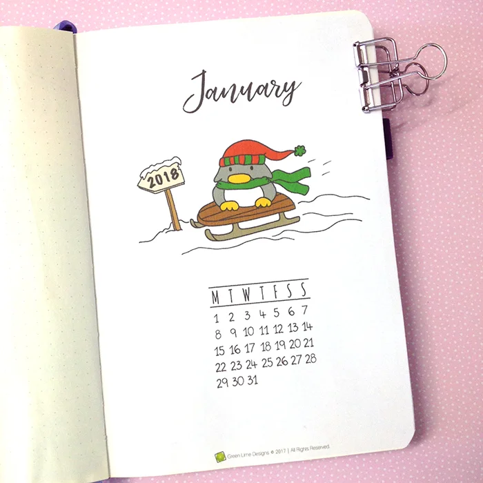
So, back to my January planning, I start the month with the usual front page and I’ve added the January page from my 2018 calendar.
You can print and use it as normal calendar, but what I like to do is to print it on a sticker paper, cut it to size and add it straight on the page. I like to use a ruler to make sure the sticker goes on straight and that there's no bubbles..
You can find the 2018 Penguin Calendar in my Etsy shop.
Moving on to the next spread which is my month at a glance. As I mentioned before, I prefer the grid layout so that's what I did again.
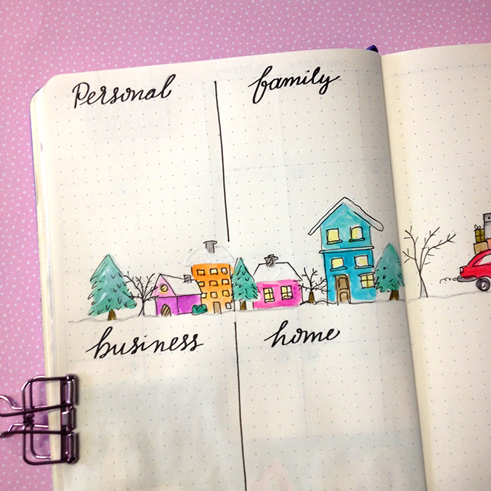
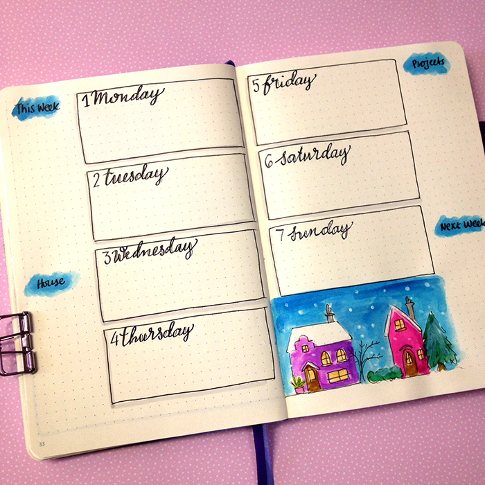
I think it’s the first time that I decided to have a theme throughout the whole set up for the month. Usually I tend to add lots of colour and doodles, but nothing cohesive throughout the whole set up. So, this time I wanted to re-create the theme of winter houses and snow.
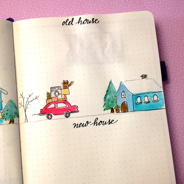
Apart from being winter, obviously, we are also moving to a new house on the last week of January, so I wanted to create something that will remind me of the move as well.
Again I’ve used the Tombow Dual Brush Markers as watercolours with my Pendel water brush. I decided to use bright colours, being inspired by a picture I saw online and I also used 2-3 shades of the same colour to create dimension. For the snow, I used some white acrylic paint and a very small dry brush.
I also have a section on the right of the calendar for all the things/events I want to remember to do this month.
Moving on to the next page and the goals and general to-dos for the month.
I usually do a list with all the goals for 4 categories - personal, family, home, and work. I kept that layout on the left hand page, but on the other page I wanted to have a section for the things I need to remember to do for the old house and other things I need to remember for the new house.
I decided to have the same theme with the winter houses on this spread too. However, in order to be relevant with the move as well, I added a car with lots of boxes on top of it. It even has a washing machine and our cat too! I don’t know if I’ve mentioned this before, but we have a cat. Her name is Lilly and she's included in the drawing as well.
I’m using the same technique like before and similar colours for the houses. But I didn’t add the sky colour so that I have more space to write on.
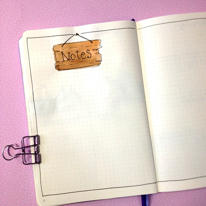
Because of the move I realised I needed more space to add things that I want to remember for the move, and therefore I created a spread for notes where I can add anything I want. I kept it minimal and instead of the houses I just added a wooden sign on top.
The last spread is my very first weekly for 2018. Again the theme of the winter houses continues and I used a very basic layout that I tend to use a lot. It has all the space and sections I need and it can be very versatile.
As you can see this month I didn’t add any gratitude log or any trackers because I know I’m going to be extra busy, so I won’t have time to do any of these things while I’m moving out.
You can watch the video as well to see exactly how I've created each spread:
So, this is my set up for January - short and sweet. Have you set up your bullet journal for January yet? Are you ready for the next year? Let me know in the comments below.
The warmest wishes to everyone for a wonderful New Year 2018!
Hope to see you again next year!
Christina x


